Overview
In 8 months, how might we simplify the management of medications through a web app?
Context
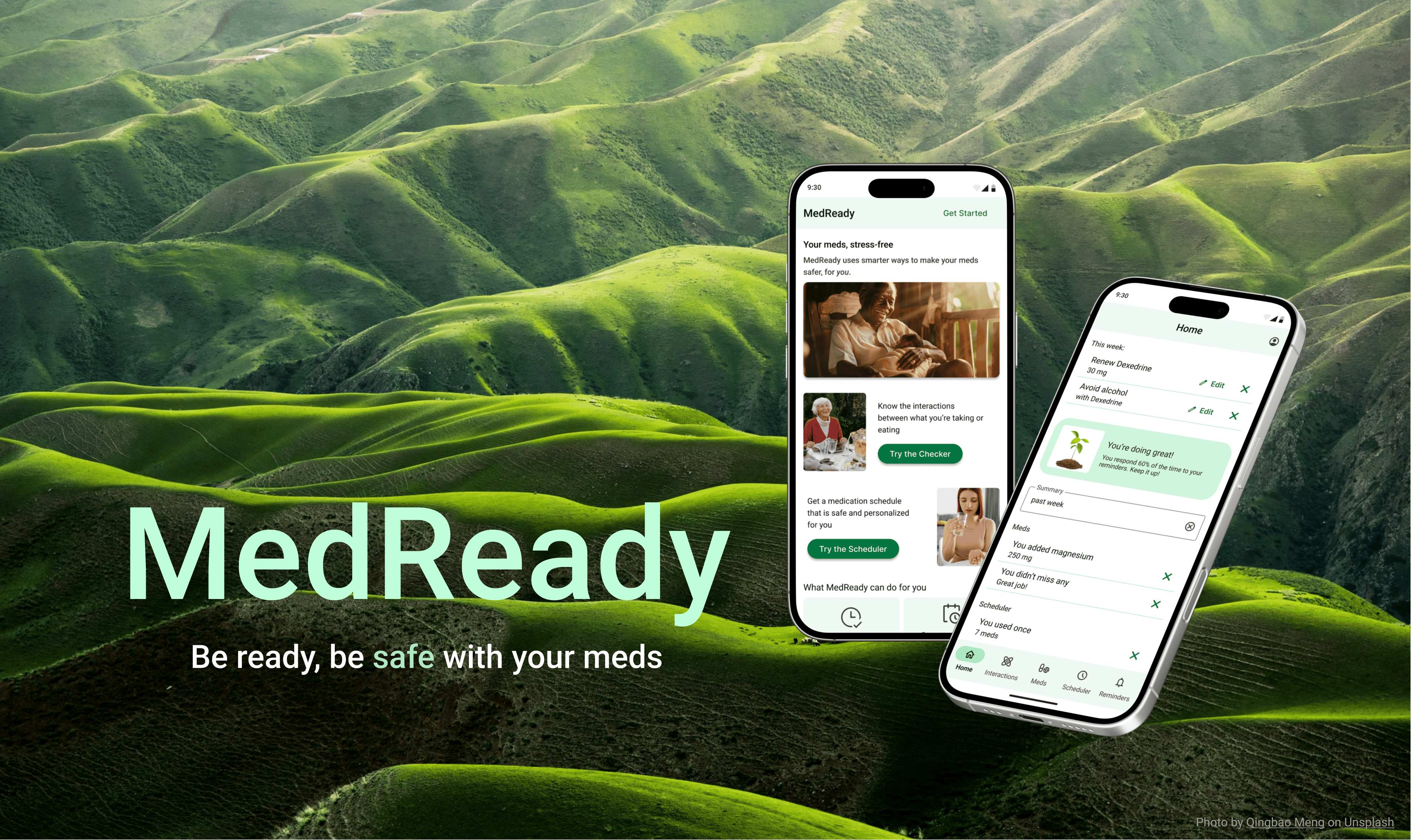
Through CareerFoundry’s UX design program, I researched, designed, created, and tested a prototype for this medication management app, MedReady, in 2024.
My Role
UX Designer
Many Thanks to
CareerFoundry tutor: Jennifer (Ip) D’Amato
CareerFoundry mentor: Anselm Dästner
Contents
Dip in with one of these talking videos
The Truth About Meds
Process: background research
For this project, I wanted to create a healthcare app that fills an important need. I remembered my days as a med student and how challenging it was to get older patients to recall their meds—the names were tough, why they were taking them was even harder, and there were too many!
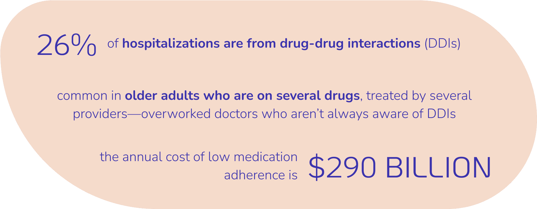
I searched medical journals for salient findings related to medications and learned some important, shocking things.
A few things crossed my mind:
These hospitalizations are totally preventable.
Doctors can’t know all the possible interactions between different drugs.
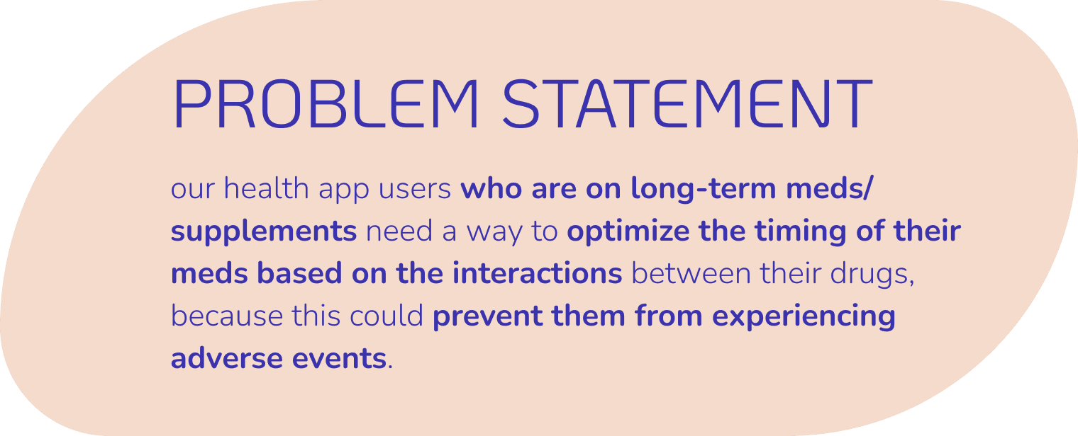
People are caught between a rock and hard place:
They could get sick from taking their slew of meds and from not taking them. They just couldn’t win.
Our Competition Knows This
Processes: competitive analysis, problem statement
I sifted through ratings and reviews of competitor apps for interactions checkers and medication reminders, played with their apps, and checked out their websites.
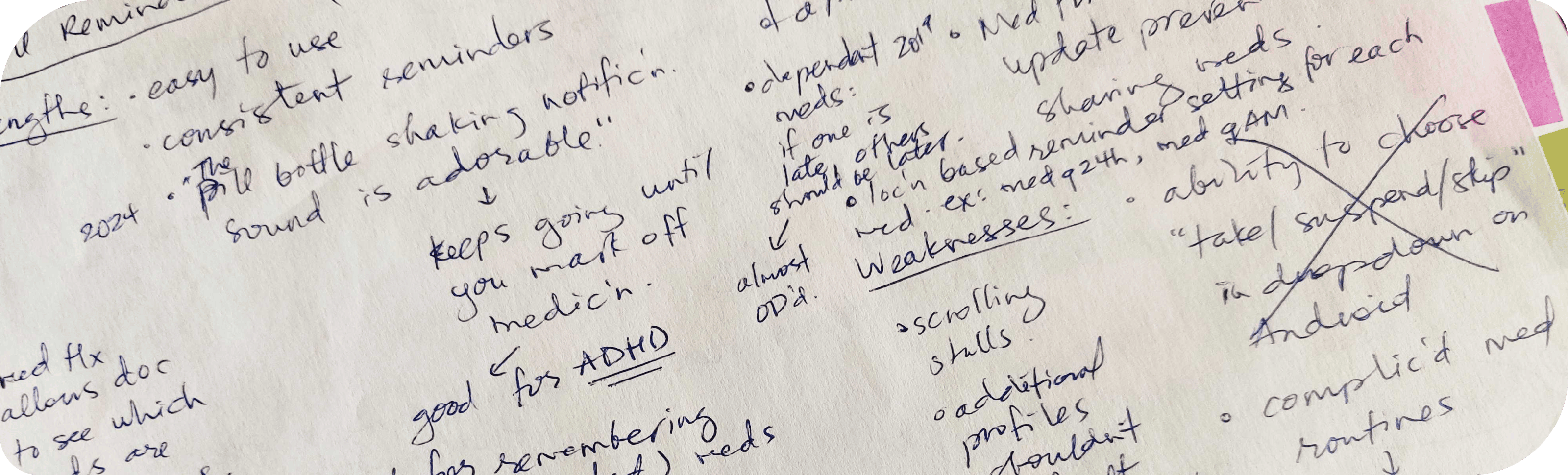
Medisafe is doing an excellent job as a pill reminder app. Their proprietary JITI™ algorithm works so well that truly, their users “Never miss a med again.”
Drugs.com is also doing an excellent job as an interactions checker. They’re the American drug database because they’re robust, independent, and peer-reviewed.
But people who are caught between a rock and a hard place now need two apps.
And these apps struggle with “clunky” UI, feel “complicated”, and don’t do the heavy lifting of optimizing a medication list based on interactions.
My app needed to be the one-stop shop with the best of both worlds, but in a way that is automatically individualized and optimized so people could simply take their meds safely without the stress of planning and thinking.
Find the competitive analysis here.
What Do the People Say?
Processes: user survey & interviews
Tools: Monday, Zoom, Google Meet, Otter.ai
I needed real-world data to validate this problem.
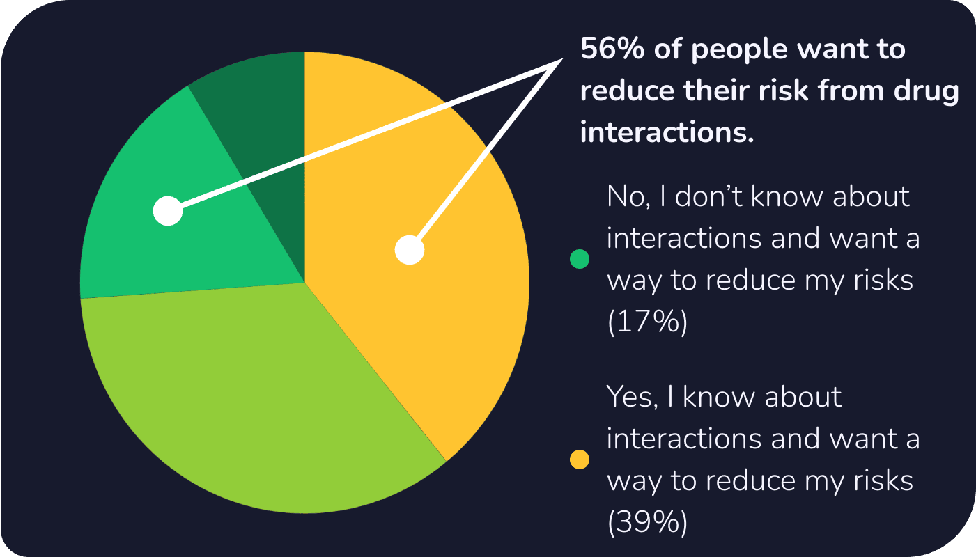
I gathered 23 survey responses and ran three user interviews.
56% of people care about drug-drug interactions and food-drug interactions but managing and figuring out that information was stressful. Then to forget to take your meds was another level of anxiety and frustration.
Get into Their Shoes
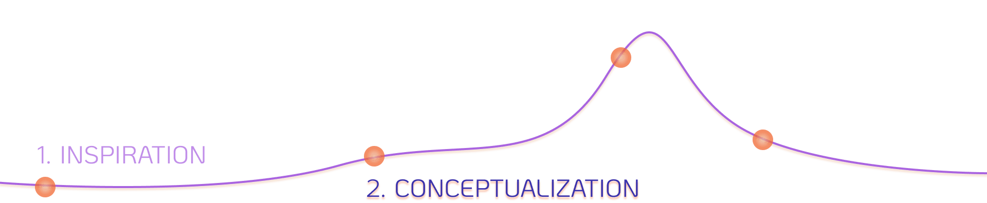
Processes: affinity mapping, user personas & stories & flows
Tools: Canva, FigJam
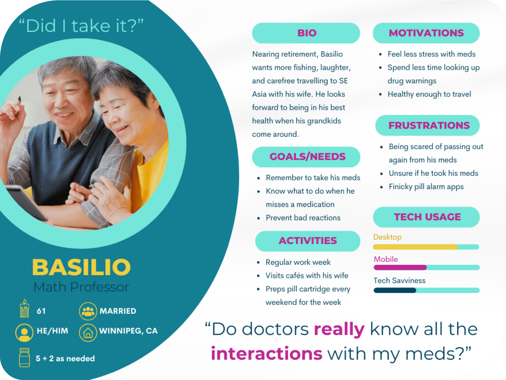
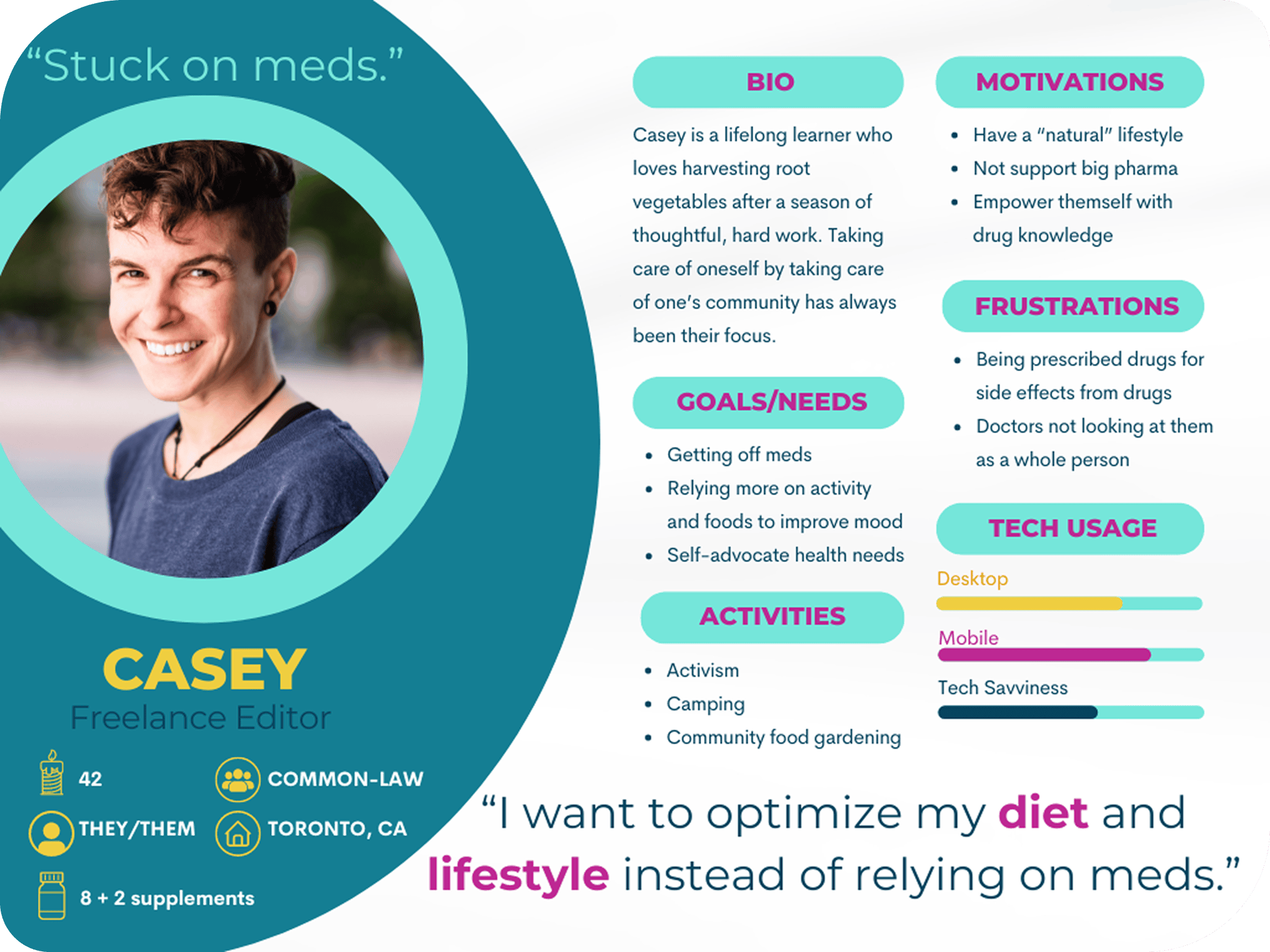
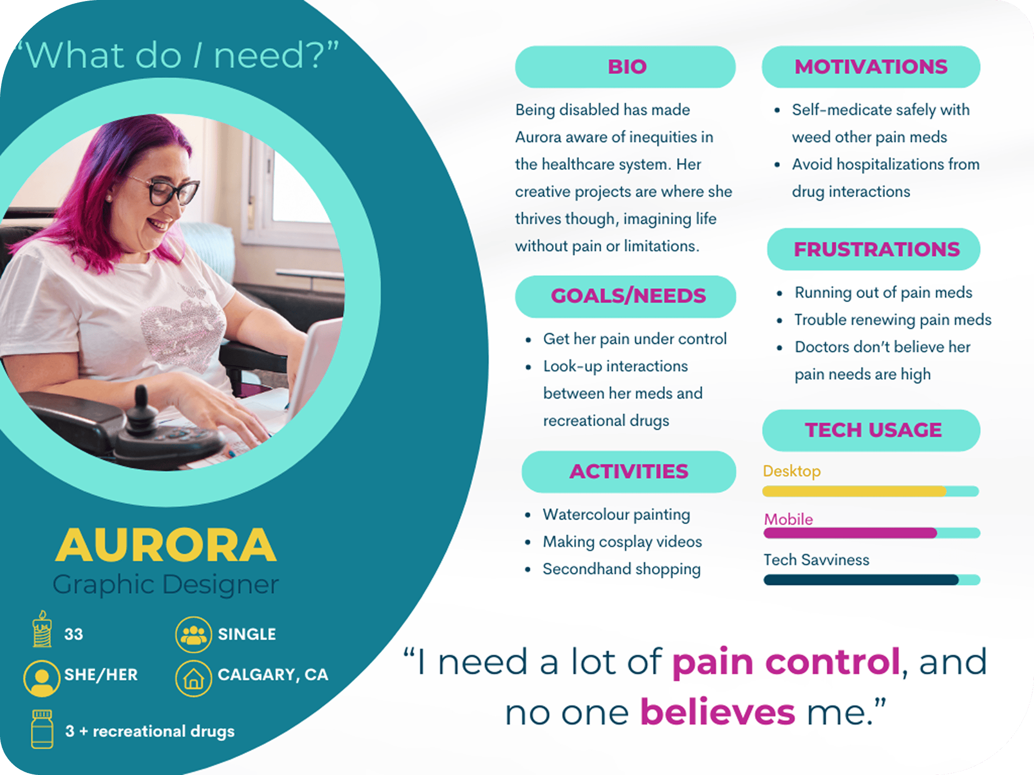
I sifted through the data and found themes and patterns by grouping observations from people’s behaviours, attitudes, needs/goals, and frustrations. From these affinity maps, I created my primary, secondary, and outlier personas.
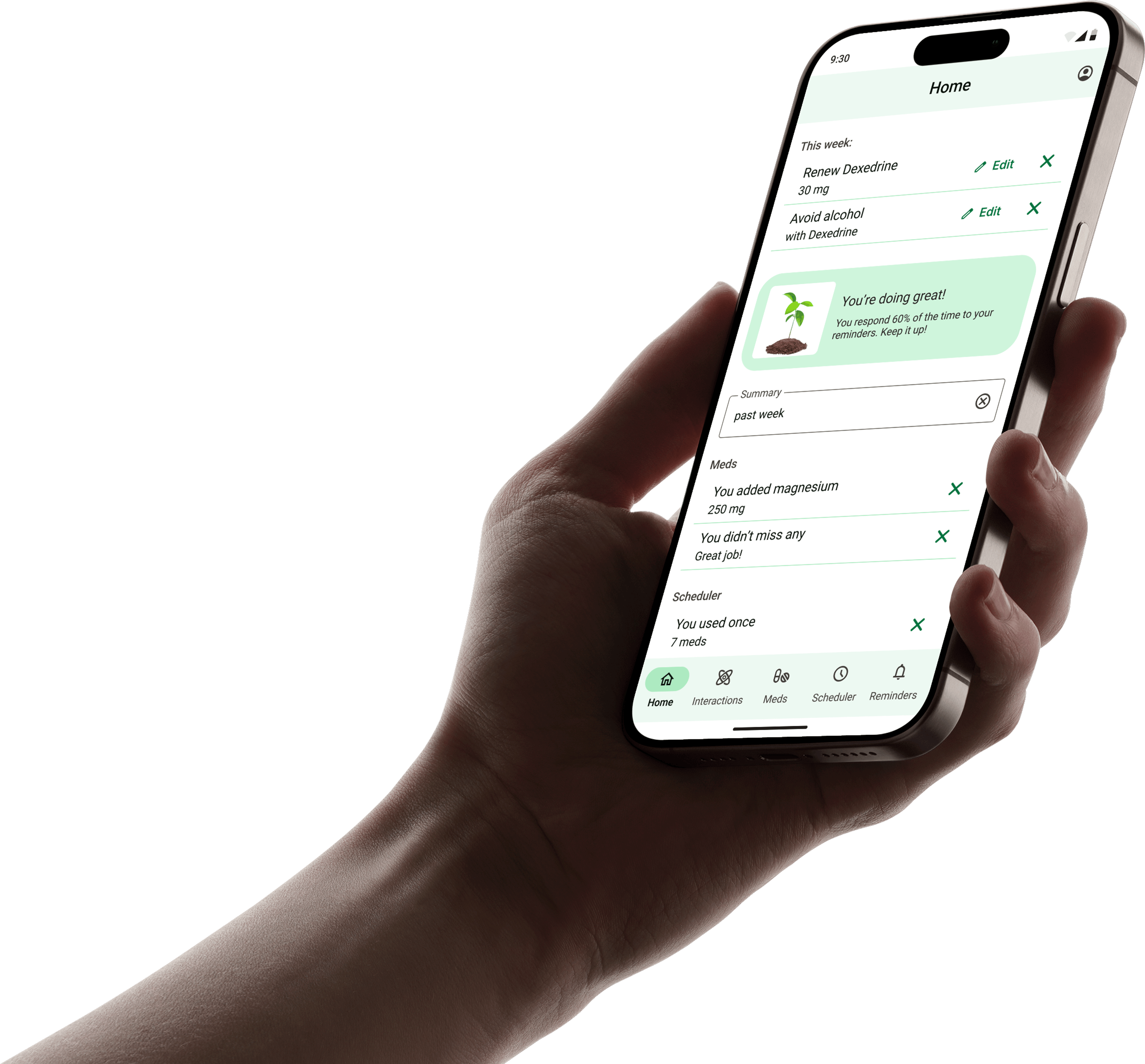
I narrowed down the goals of my primary persona, Basilio, to three goals. This older gentleman wants to:
- know the interactions of his meds
- know the best times to take his meds based on those interactions
- remember to take his meds
He also wants to achieve these goals without the help of a million different apps or a million things to click on, and with the information being clear, short, and saveable. In other words, make his meds stress-free!
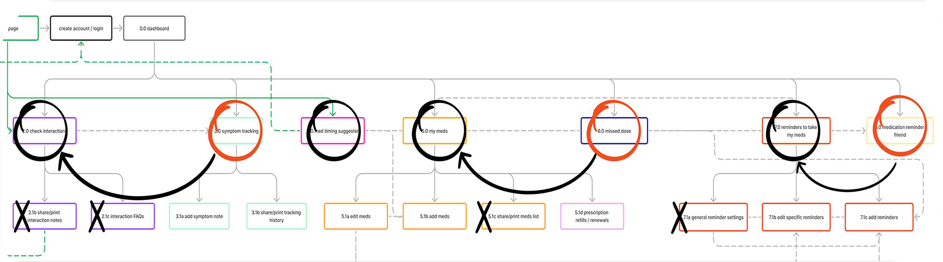
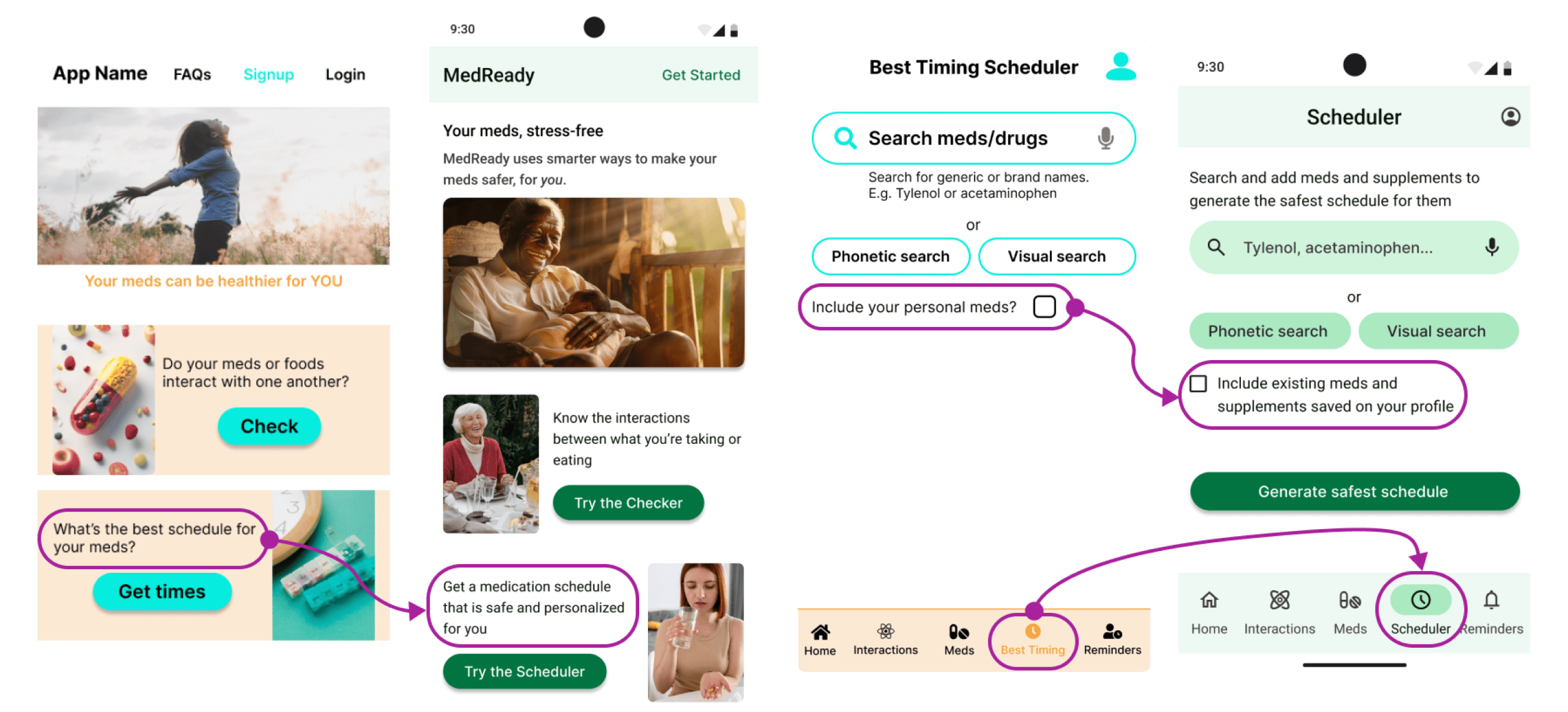
From his user stories, I considered how Basilio would achieve them in the app and drafted user flows. There was the question of how these features could be best organized into the app, which was the task of a sitemap.
Everything was making sense, but as I began rapid prototyping, an issue emerged.
How Would They Group These Features?
Processes: sitemap, closed card sort, feedback
Tools: FigJam, OptimalSort
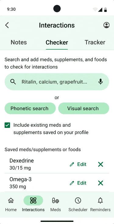
My sitemap had more than five high-level categories, so two would hide in a hamburger menu which I didn’t like, knowing what’s not visible is forgotten.
My tutor (Jennifer (Ip) D’Amato) suggested doing a card sort to figure out another way of organizing these categories and that using a tab menu in addition to the bottom tab bar could do the trick!
The card sort allowed me to see how seven people grouped my app’s features and categories, and OptimalSort created helpful analytics.
I learned that people grouped symptom tracking with food/drug interactions and prescriptions with medication reminders and reminders could be for meds or prescriptions. I updated the sitemap where features were nested within the main five.
Find the updated sitemap here.
Find the Quickest Route
Processes: user flows, rapid prototyping, low/mid/high-fidelity wireframes
Processes: FigJam, Figma
The flows needed to be adaptable and do more heavy lifting for the user. As I reflected on my low-fidelity wireframes, I realized my user flows could be more streamlined.
Familiar and recommended navigation and usability patterns were used, so users don’t get lost. I made their location in the app clear and the text easy to read, especially for an older age group.
I also used visual design principles, like spacing, high contrast, and hierarchy, to reduce cognitive load and clarify the main action on a page.
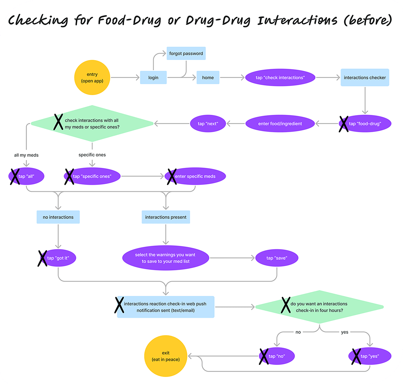
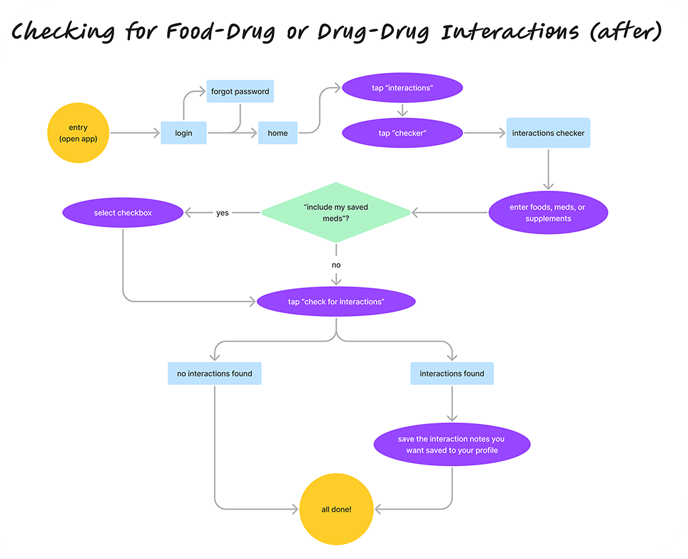
However, people were confused when they tested this app. And I had to understand why that was.
Use Their Language
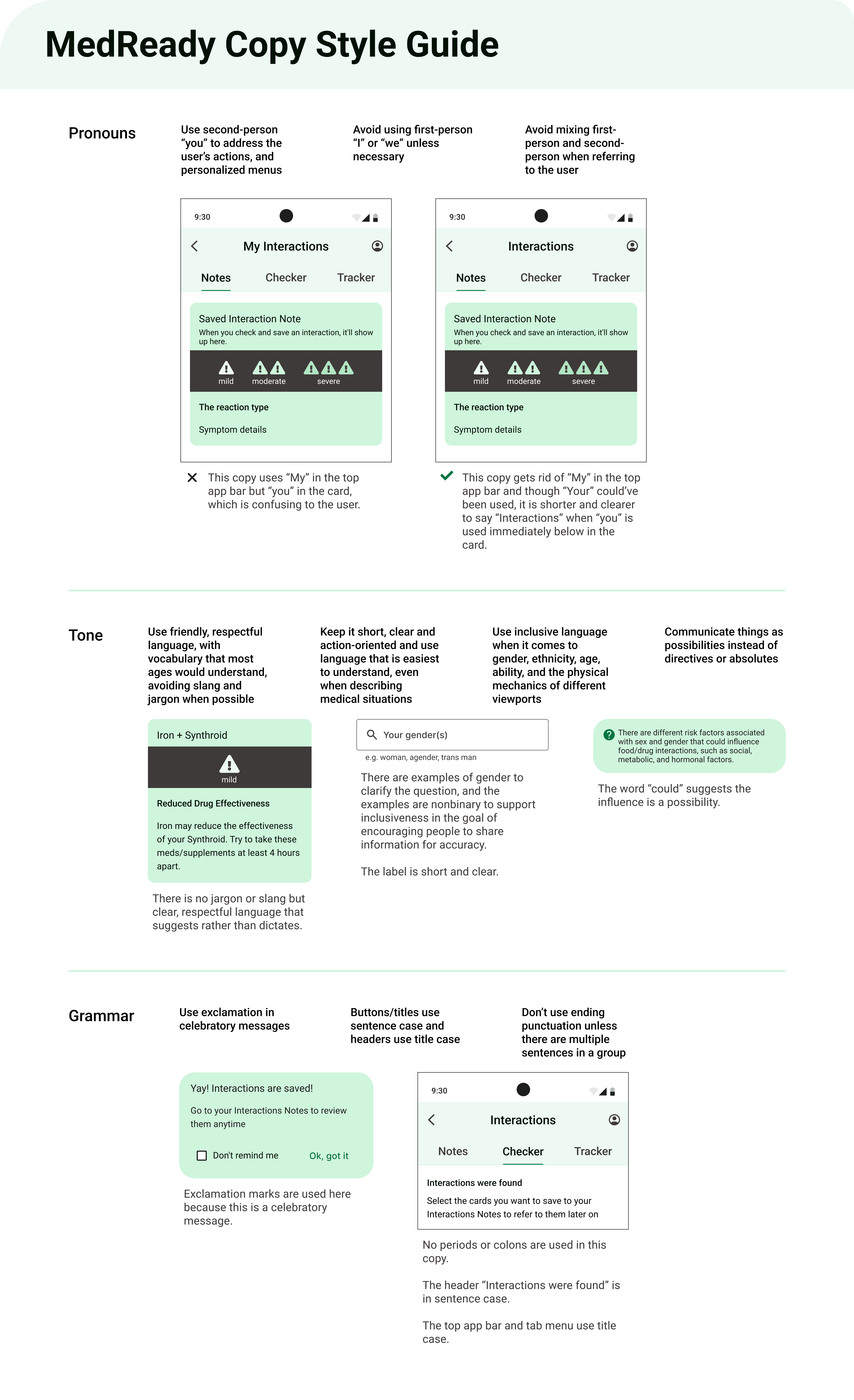
Processes: UX writing, usability testing, rainbow spreadsheet, preference testing, copy style guide
Tools: single-ease question, system usability questionnaire, Sauro’s error rating scale
“Aren’t your meds already ‘personal’ to you? Wouldn’t ‘saved’ or ‘existing’ meds be better?”
Usability Testing Participant 2
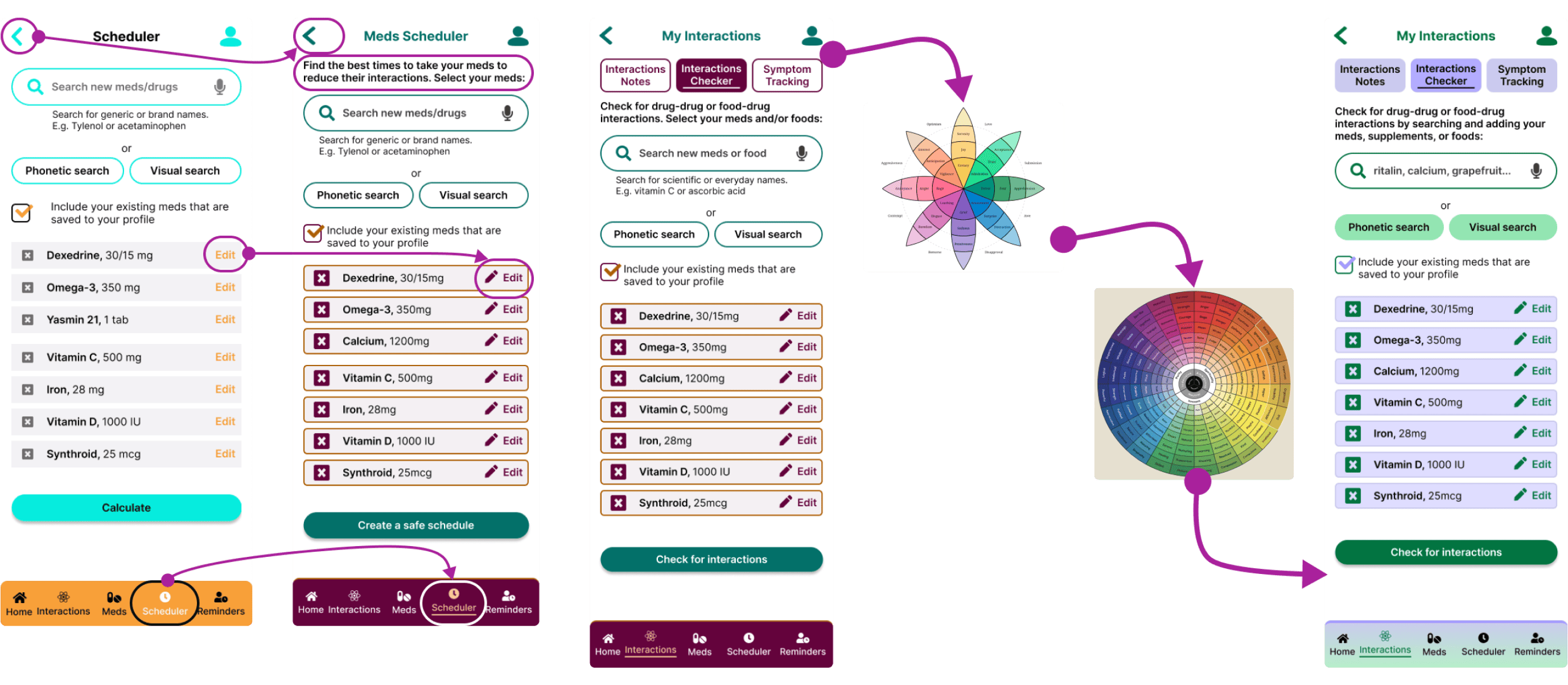
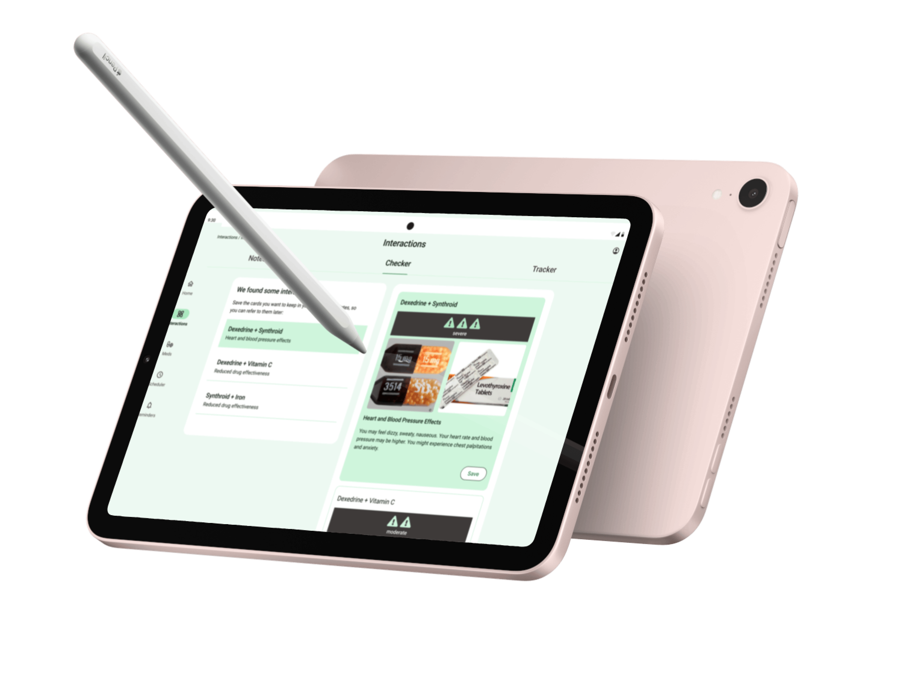
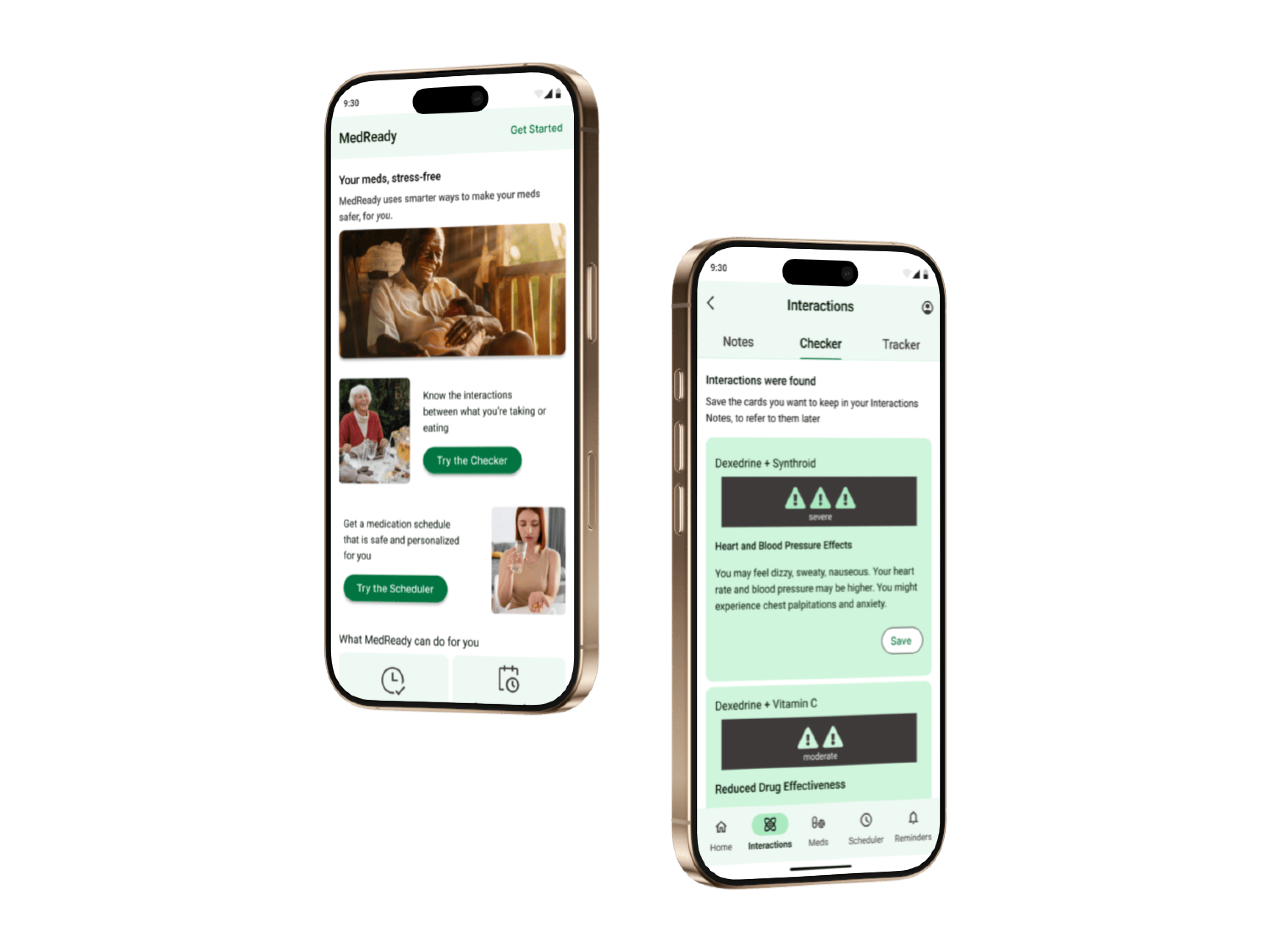
From running usability tests—where I got my six participants to complete several tasks—and organizing the data into a rainbow spreadsheet (download here), I found that people are such divergent thinkers.
Take for example, ‘Best Timing.’ Some people interpreted it as ‘schedule,’ others as ‘reminders,’ and some just weren’t sure, but many didn’t think to tap on it when asked to figure out the best schedule for their meds. It turns out, they’ve never used a scheduler that considered the interactions of their meds. This was something completely new to them.
Another example is people didn’t click on ‘Include your personal meds’ that was designed to save them time when checking for interactions. “Aren’t your meds already ‘personal’ to you?” one participant asked. Another suggested switching out ‘personal’ with ‘saved’ or ‘existing’. “But where is it saved? On this phone app or my account? Am I signed in?” This little checkbox was a huge source of ambiguity.
As a writer, some of these details seemed obvious after the fact, and ultimately, the feedback motivated me to continue improving my UX writing.
The MedReady app did better than average in terms of usability (a SUS score of 79.2), so most would find the app generally easy to use, but the task success rates weren’t great for checking interactions (0.6/1).
I iterated with these findings and insights in mind and validated them, as needed, with quick preference tests. I also created a copy style guide to keep wording and styling consistent.
Then, Jennifer, my tutor, called my attention to an important gap: my colours didn’t pass accessibility standards.
How Accessible Is this Design?
Processes: iteration, feedback
Tools: Web Content Accessibility Guidelines, Stark plugin, Figma
Especially because my primary persona is someone 60+ years old, the text and actions needed to be as clear as possible to support visual impairments, cognitive impairments, mobility issues, etc. Then, the people who would find value in this app could actually use the app.
I looked at accessibility guidelines (WCAG) to ensure a contrast of at least 4.5:1 and have large enough touch targets, for example. The Stark plugin in Figma helped me to check the contrast and visual perceptions of my iterations.
But how would this design make people feel? I wanted the app to cultivate a friendly and professional relationship that is calming, helpful, and trustworthy.
Jennifer suggested using an emotion colour wheel with more variation and nuance and gave me feedback on the visual design of my new colour choices, but I was still stuck.
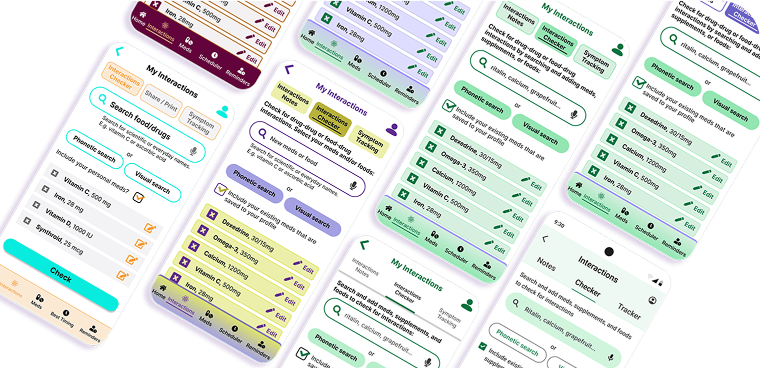
My design looked cluttered and chunky. For a screen that displayed a lot of information, it needed to look smart and stress-free.
Look Outside and Inside the Box
Processes: research, iteration, feedback
Tools: M3 UI kit, M3 style guide, Figma
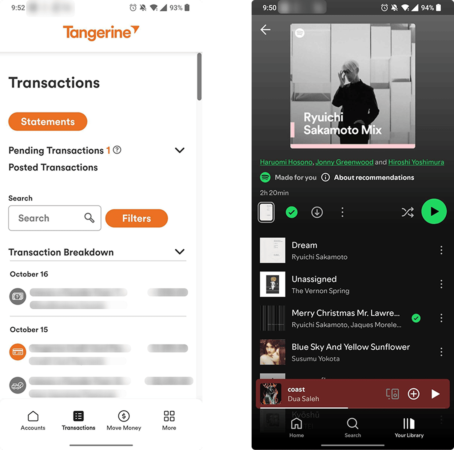
I looked at other non-health apps that commonly display lists and landed on Tangerine and Spotify.
I realized I could use more empty space, a simpler palette, and emphasis on only the most important actions, while retaining some brand uniqueness. I considered M3’s guidelines and UI kit and iterated.
Other designers, including Jennifer and Anselm Dästner (my mentor), gave thoughtful feedback on things like: copy, spacing, and button sizing and positioning with primary, secondary, and tertiary actions.
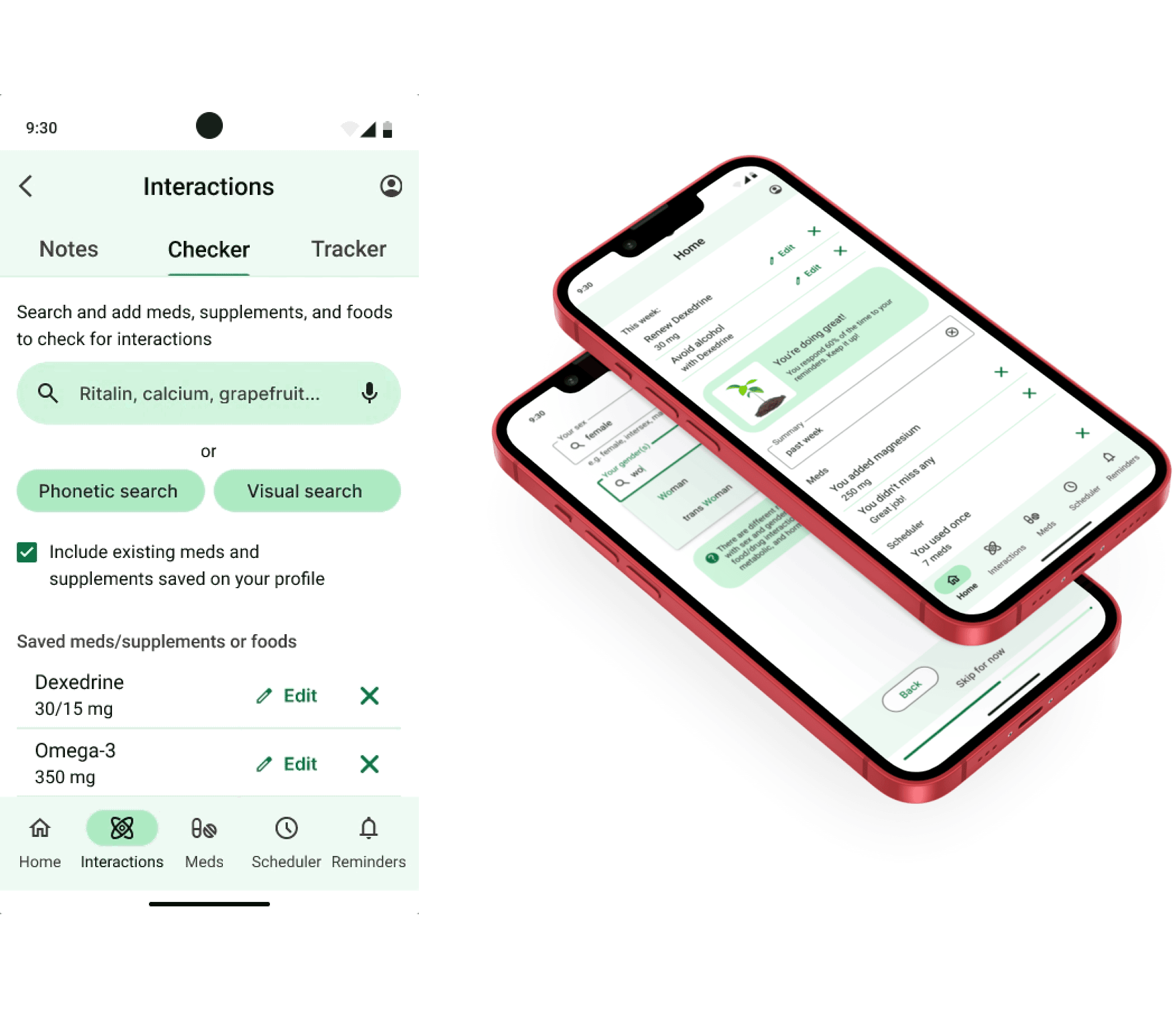
My 5-minute prototype demo is below, focusing on the scheduler tool and onboarding.
Transform with Insightful Feedback
Processes: hypothesis, reflection
After this iteration cycle, I had some ideas of hypotheses I would test for the next iteration. For example, would usability improve if people could save the new meds they’ve searched in the interactions checker onto their profile, or if the scheduler is integrated to schedule reminders based on interactions as they’re adding a new med?
This project showed me the power of adapting insightful peer and user feedback.
I also had a lot of fun creating an app that:
- fills a need I’m passionate about
- used real data from real people
- required creative thinking and precise language
- embraced the iterative process
Once again, feel free to peruse the 5-minute prototype demo here.
Or watch a video presentation of this case study here.
Thanks for reading!
~ ViNa Nguyễn
QuickWord, taking coffee breaks to another vocabulary level