Overview
In 1 month, how might we turn short work breaks into effective vocabulary-learning sessions?
Context
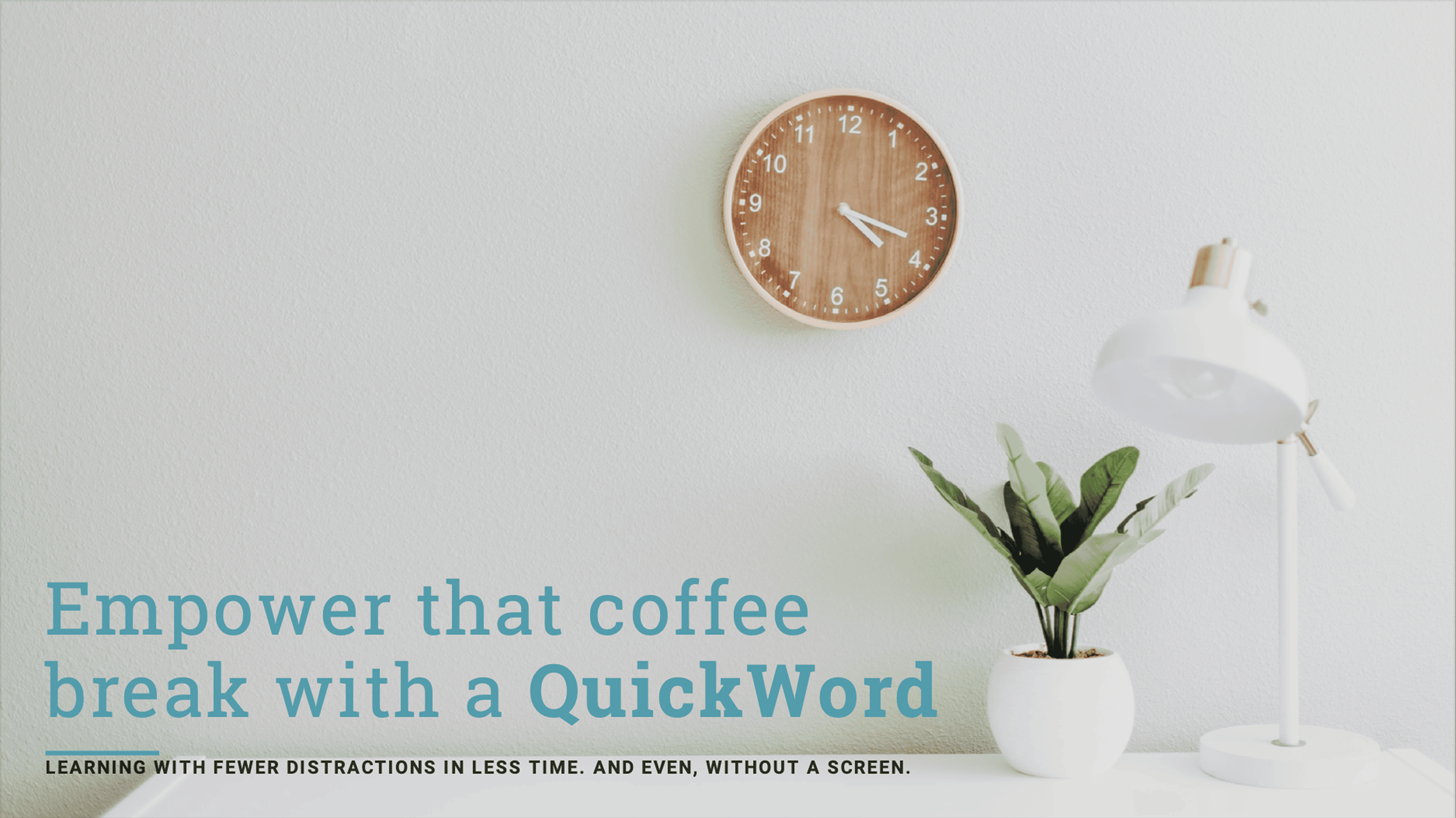
Through CareerFoundry’s UX design program, I researched, designed, and tested a low-fidelity prototype for a flashcard language-learning mobile app, QuickWord, in 2024.
My Role
UX Designer
Many Thanks to
CareerFoundry tutor: Jennifer (Ip) D’Amato
CareerFoundry mentor: Anselm Dästner
Contents
Dip in with one of these talking videos
Meet Research Buddy ChatGPT
Process: competitive analysis
Tool: ChatGPT
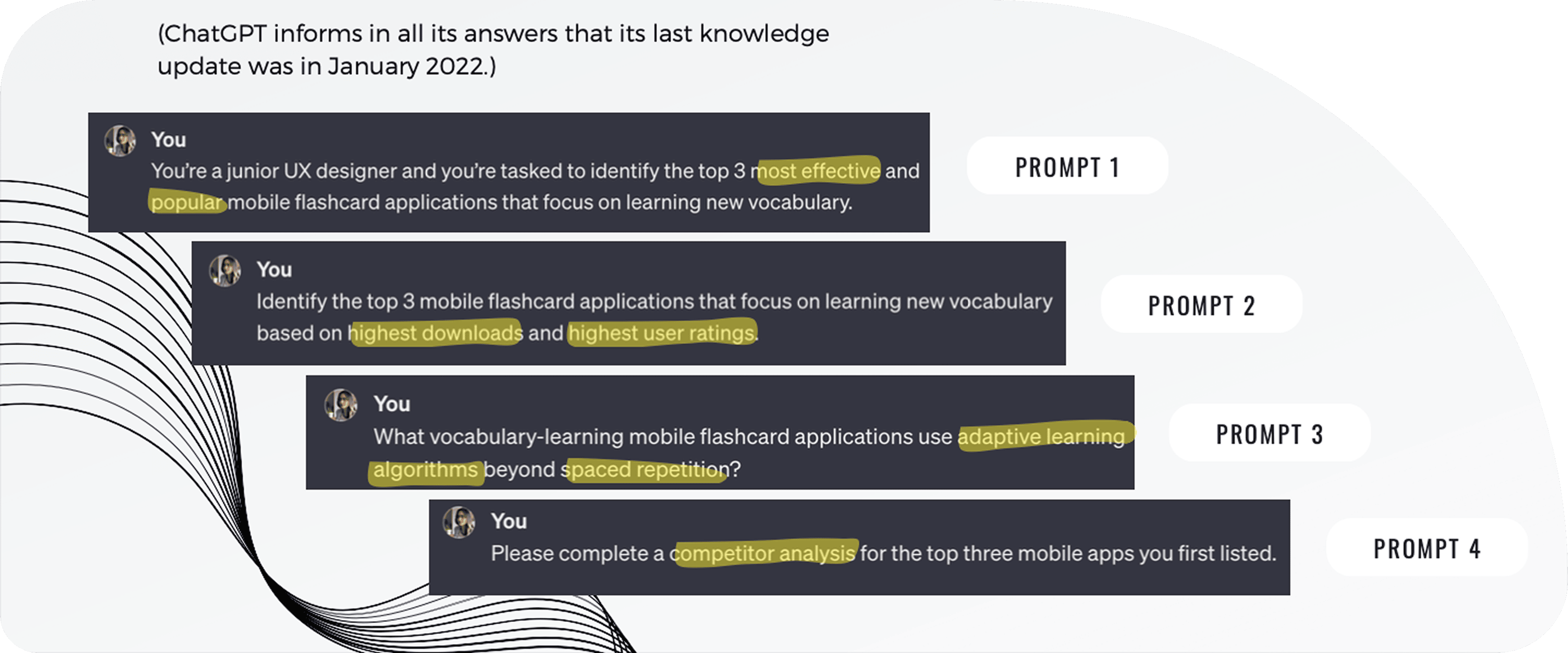
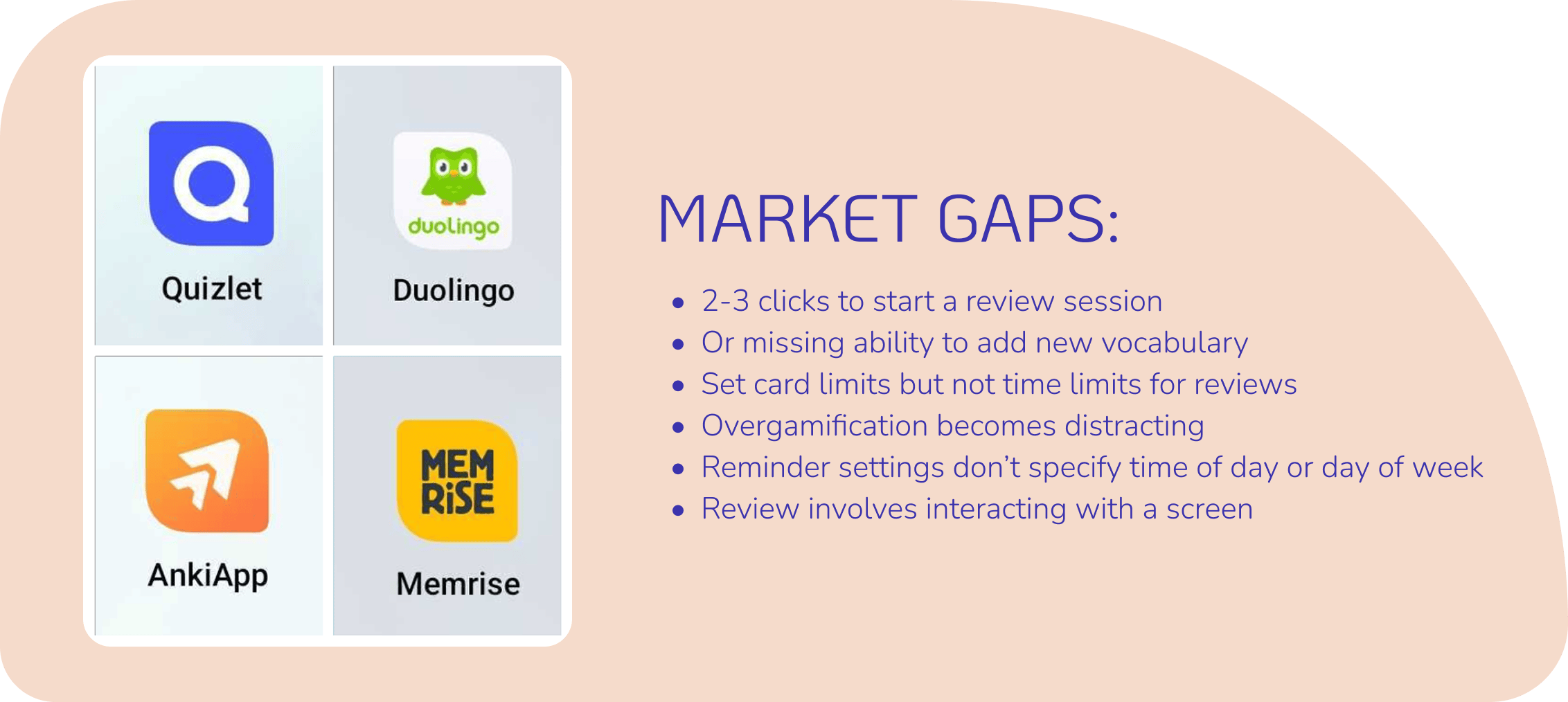
There are plenty of language-learning flashcard apps out there, but why are learners still dropping off or giving up? Get a sense of the landscape: I searched online, played with competitor apps, and combed through user ratings and comments, then turned to AI to test and gauge my findings.
ChatGPT said “the most effective and popular” apps were: 1) AnkiApp; 2) Quizlet; and 3) Memrise. Apps with the “highest downloads and highest user ratings” were: 1) Quizlet; 2) Memrise; and 3) Duolingo.
The results demonstrate the significance and specificity of the language tokens used to attain analyses from ChatGPT—what might be the difference here in assessing “most popular” versus “highest downloads and ratings”?
I chose to focus on the former three apps because they are most similar in form and function, but I kept Duolingo in mind for its popularity, emotional design, and gamified approach to vocabulary learning.
ChatGPT was most useful in gauging and supplementing my own already-formed assessments. I compared its competitor analysis with my own and found similarities as well as learning points. Its responses also helped me to look up concepts I’d overlooked, like spaced repetition and adaptive learning algorithms.
Ask the Learner
Processes: user research, user interviews, primary persona
Tools: Otter.ai, Figma
I conducted 3 user interviews to understand the environment and needs of our learners and used Otter.ai to transcribe notes during the interviews, so I could focus on the interviewee and high-level themes.
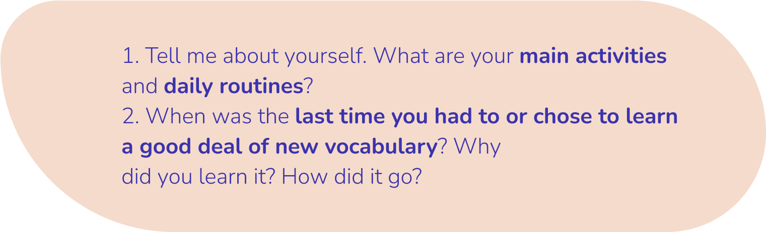
We needed to know when someone would use a flashcard app to learn new vocabulary—are they on a bus, on a coffee break, driving home, walking to the grocery store? This context points to question 1.
And why would they use it? Is the goal to become fluent in another language or proficient with new course material? And what are some pain points? This points to question 2.
Learning can be a challenging—even frustrating, journey.
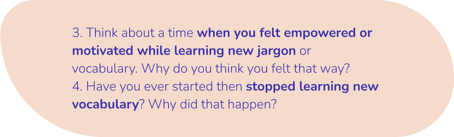
A deep dive into the pain points to understand what supports motivation and empowerment and what makes a learner give up were the goals of questions 3 and 4.
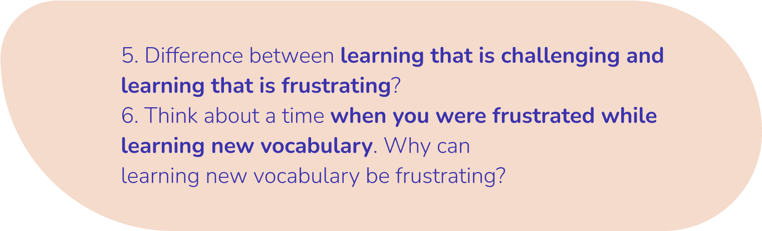
The vital difference between learning that is challenging and learning that is frustrating was explored in question 5.
Frustrations are dangerous because learners will fail to reach their goals and will stop using the app. We wanted question 6 to specifically address that head on.
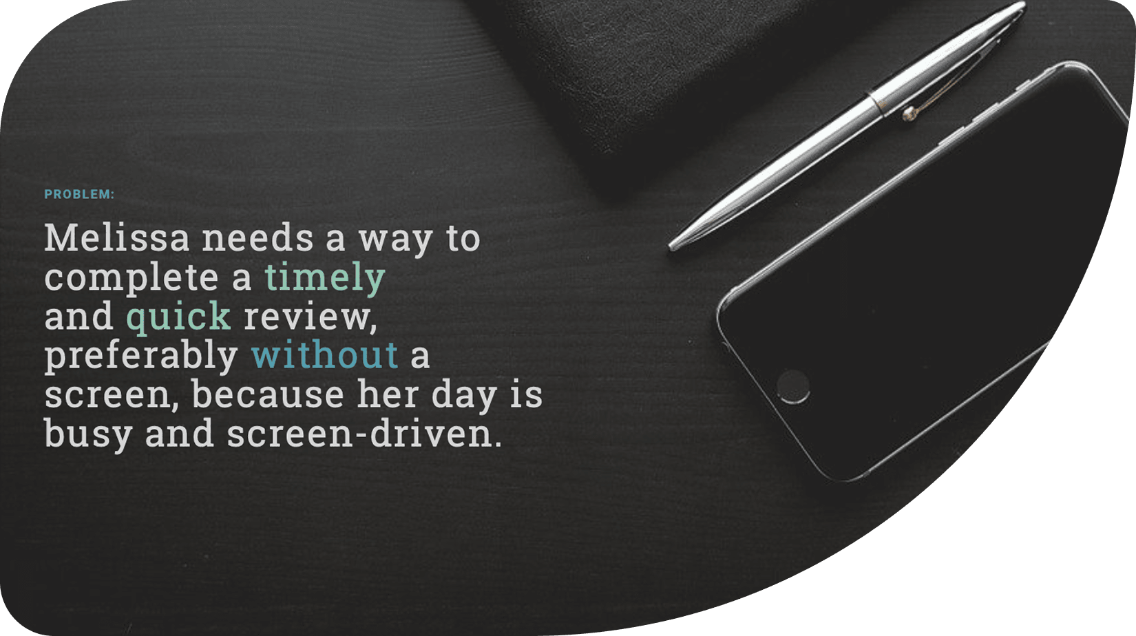
After I sorted and aggregated the data, I created our primary persona. Meet Melissa Kabbani, a 35-year-old lawyer from Canada.

The Woes of the Learner
Processes: affinity mapping, defining the problem statement
A major frustration was feeling that there’s simply not enough time in a day to get all the things they wanted done. Learning a new language or diving into jargon never makes the cut.
When there’s a spare moment to practice, the feeling of having to start over or to put a lot of thinking and effort into deciding what to do was overwhelming and frustrating. Paired with screen fatigue, it was too easy to quit.
Keeping motivated was another struggle. The social aspect is vital.
What Are the Necessary Flows?
Processes: user stories, job stories, task analyses, user flows
From Melissa’s needs, user stories were written that were then converted to job stories to provide more context—an example:
User story: “As someone who gets easily bored, I want a learning stint to be entertaining and short, so that it keeps my focus.”
Job story: “When I’m exhausted from work, I want learning that is fun and doable, so I can have a higher chance of completing it.”
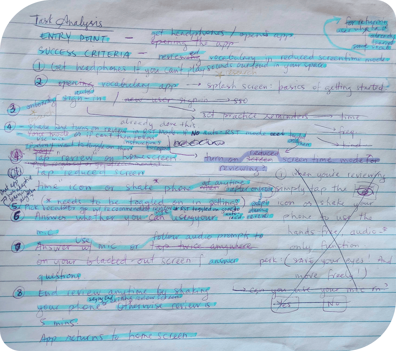
But the project brief also provided requirements for what needed to be built. Altogether, the flashcard mobile app prioritized 4 task flows:
- Onboarding
- Learner sets reminders to practice vocabulary
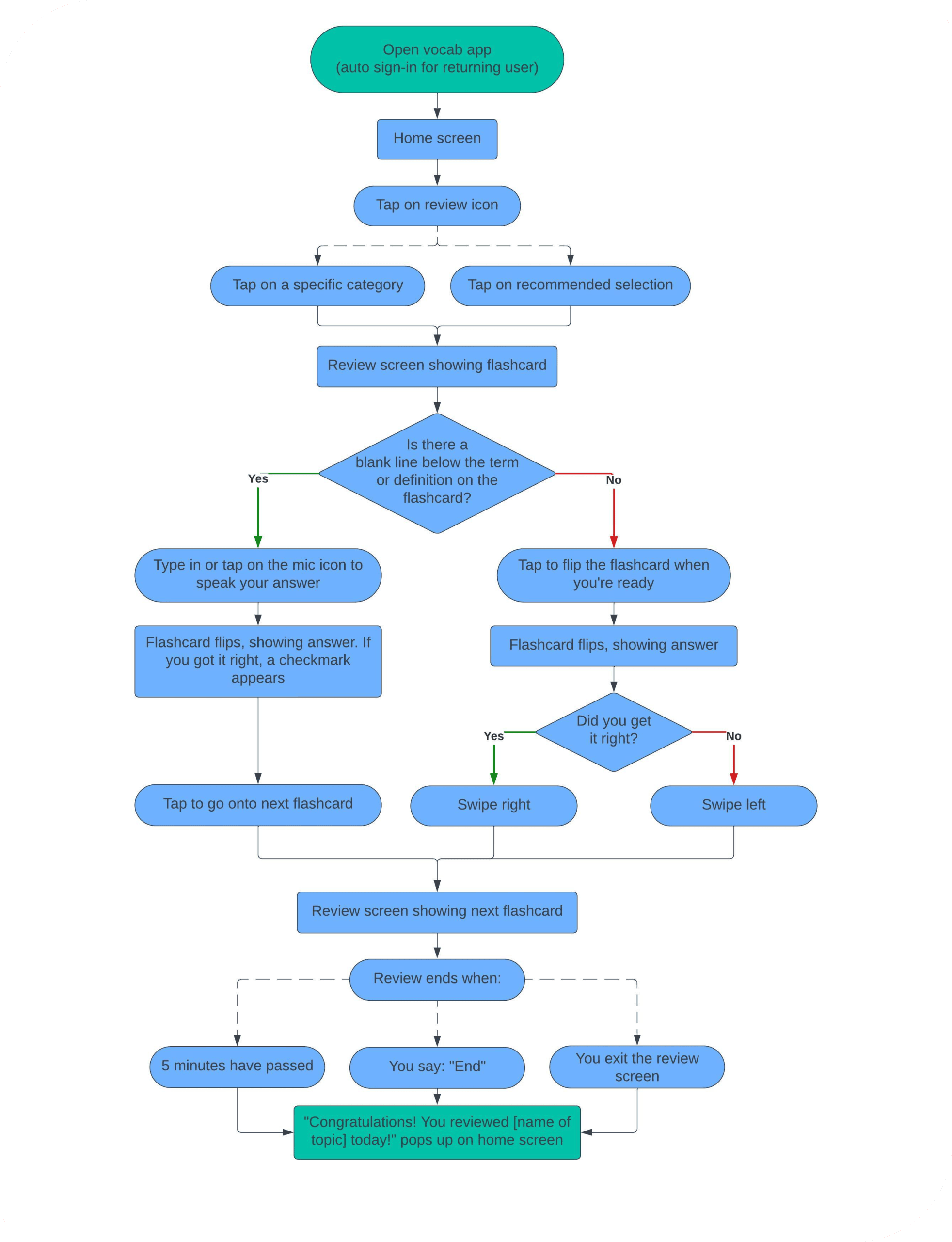
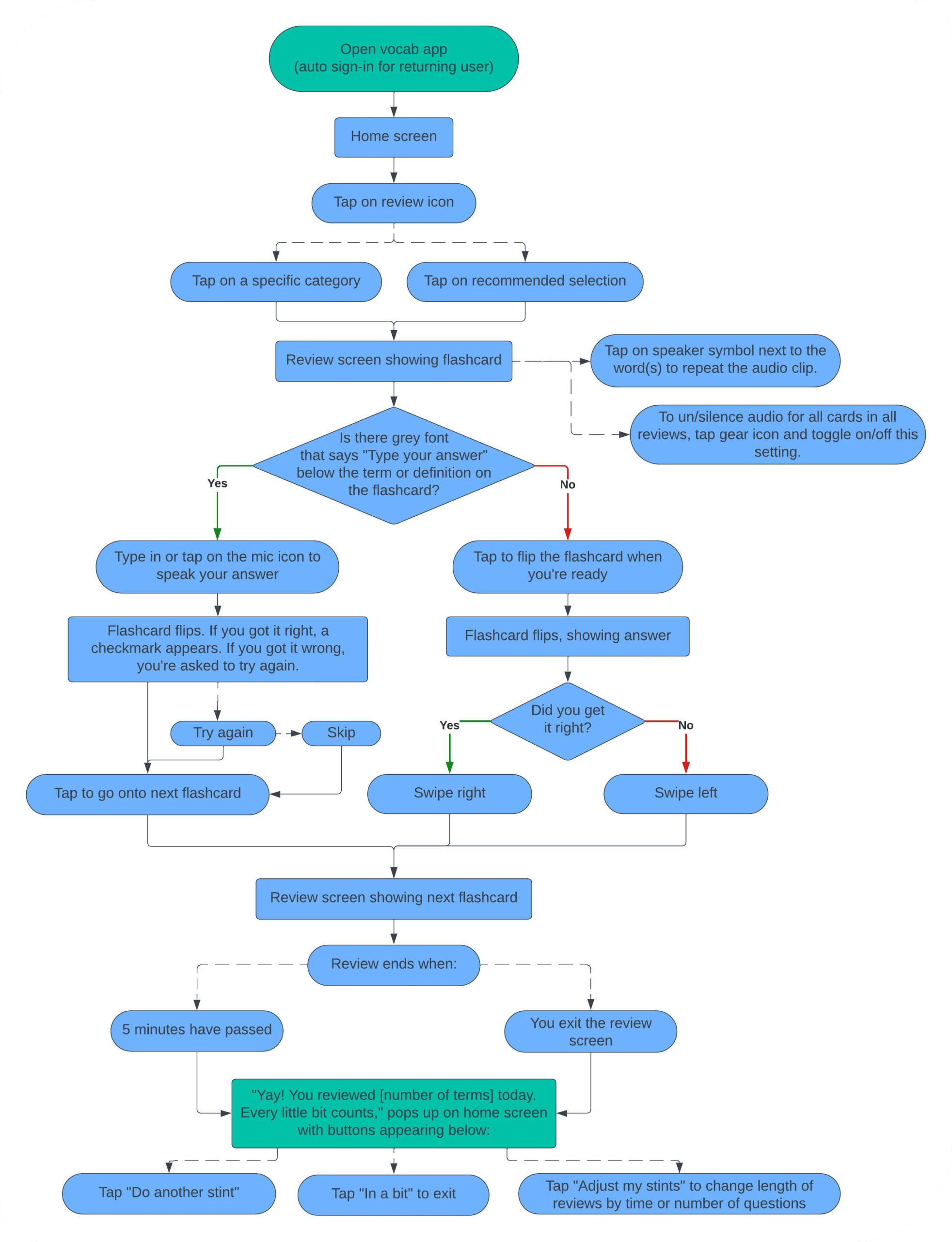
- Learner completes a vocabulary review (with reduced screen time mode)
- Learner adds a vocabulary card
I played with our competitor apps and sought out feedback from my tutor, interviewees, and colleagues to improve the user flows.
View all the user and job stories here.
Quick Sketches
Processes: rapid prototyping, low-fidelity wireframing
Tools: Figma, pen and paper
User flows guided my rapid prototyping for:
- Onboarding
- Doing a vocabulary review (with screen break mode)
- Setting/changing reminders
- Adding a new term/flashcard
Starting with low-fidelity wireframes allowed me to quickly follow up with usability testing and making efficient changes.
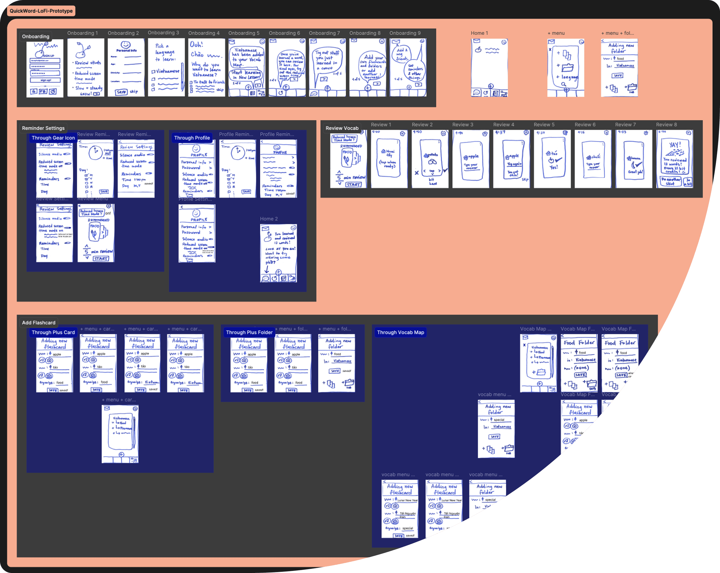
You can view a walk-through of my low-fidelity prototype below.
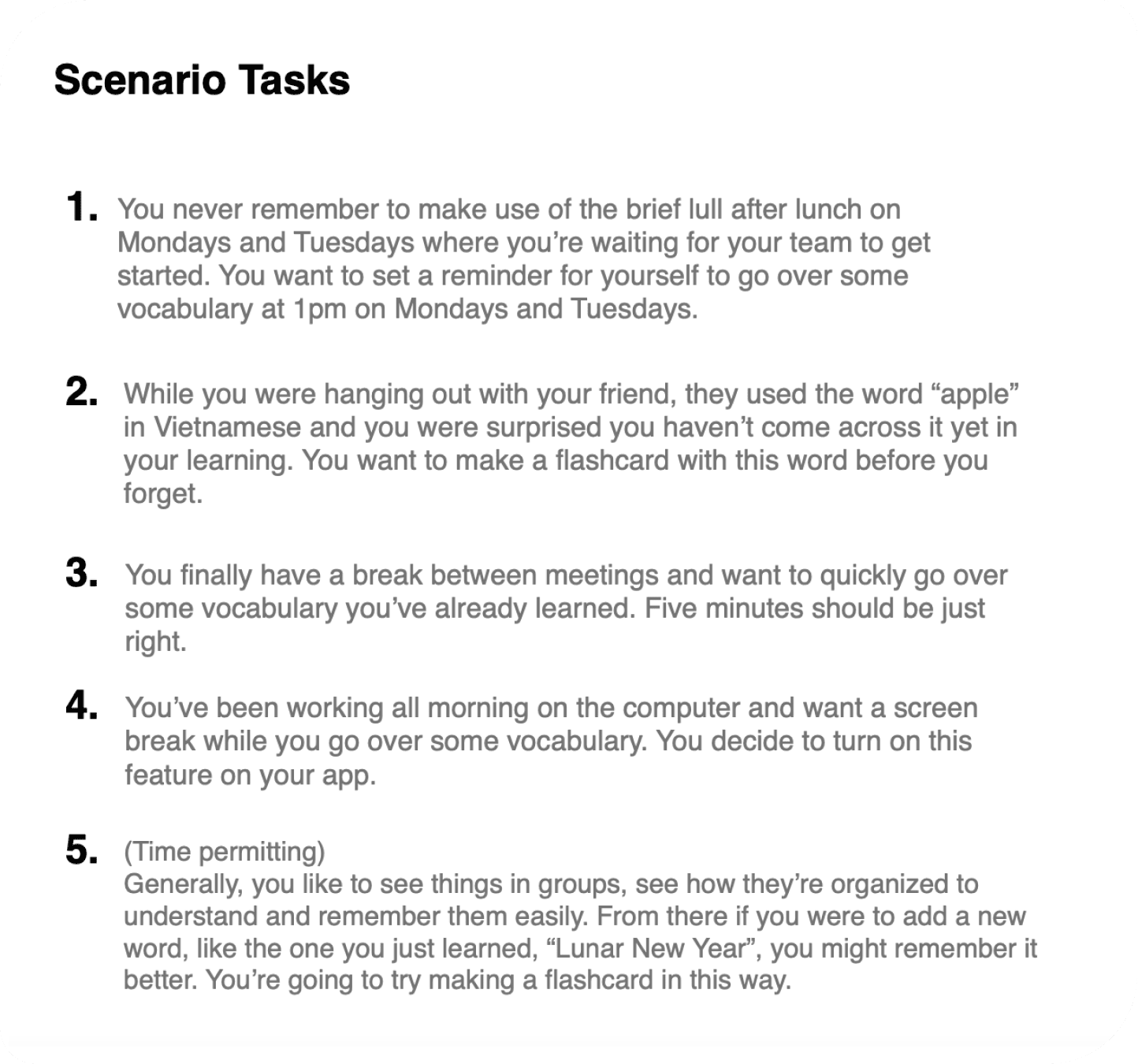
When in Doubt or Certainty, Test It
Process: usability test scripting
Tools: Figma, ChatGPT
For our 15-minute usability tests, I limited our direct tasks to 4 that were tied to our user flows/main goals. The direct tasks were explicit guides for my scenario tasks that were more accurate reflections of the context a learner could be in as they completed the tasks. Scenario tasks offer more accurate data on how usable a prototype is.
I used ChatGPT to see what improvements could be made to my usability script, focusing on making the script more realistic and user-centred, like incorporating forgetfulness and breaks at work, for example.
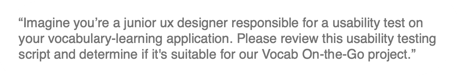
ChatGPT suggested more explicit task directions. However, I was careful not to use words that could give away the navigation of my prototype. I appreciated the extra practice in assessing which suggestions were worth taking on or how to balance them out with alternate possibilities.

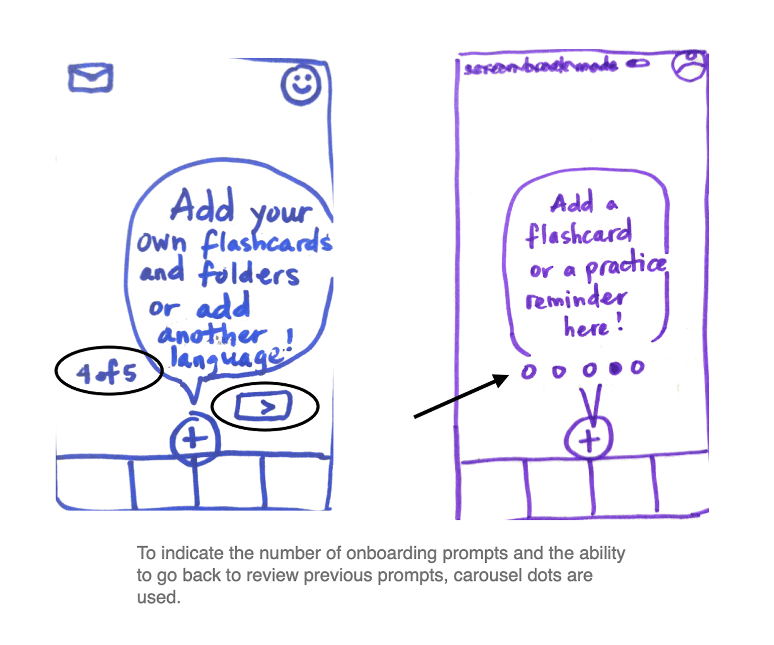
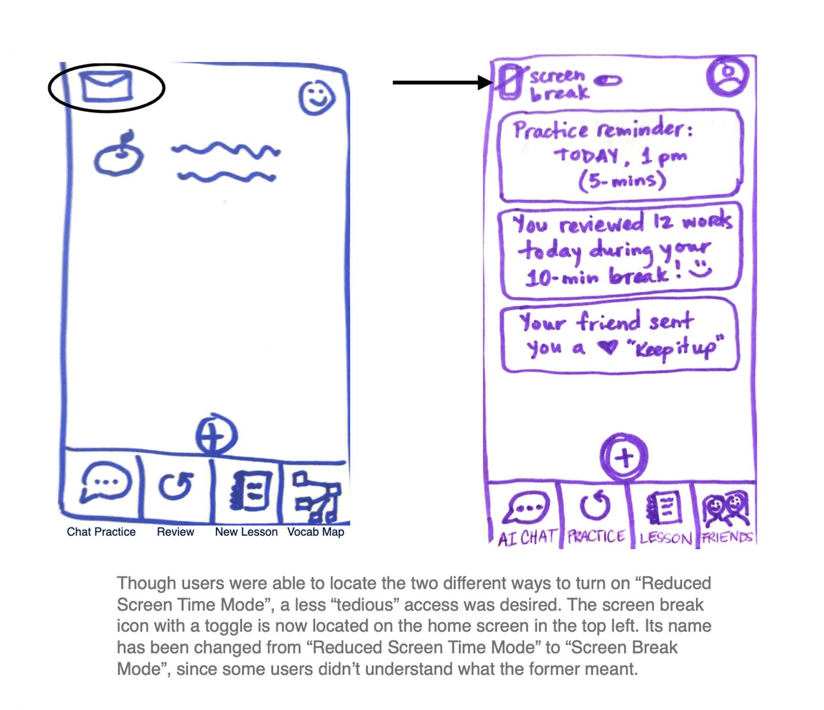
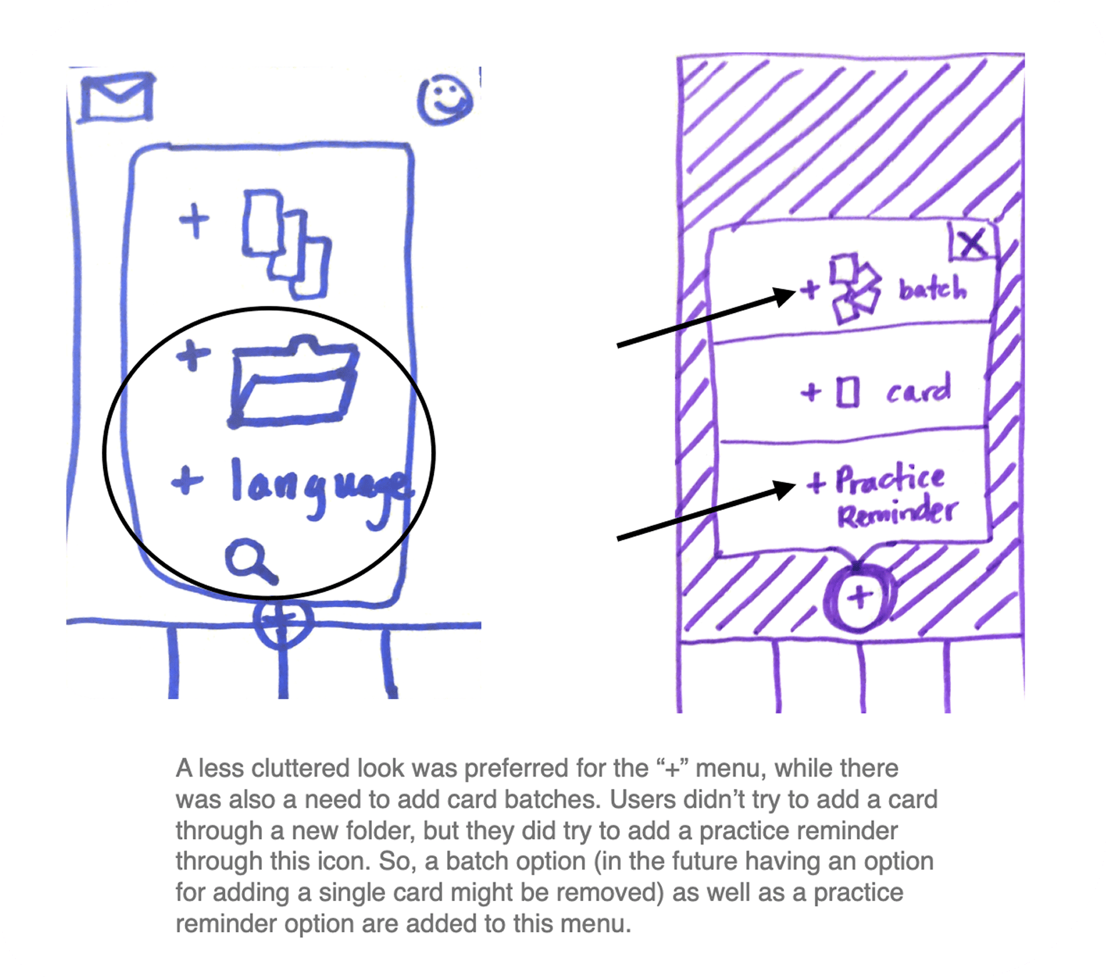
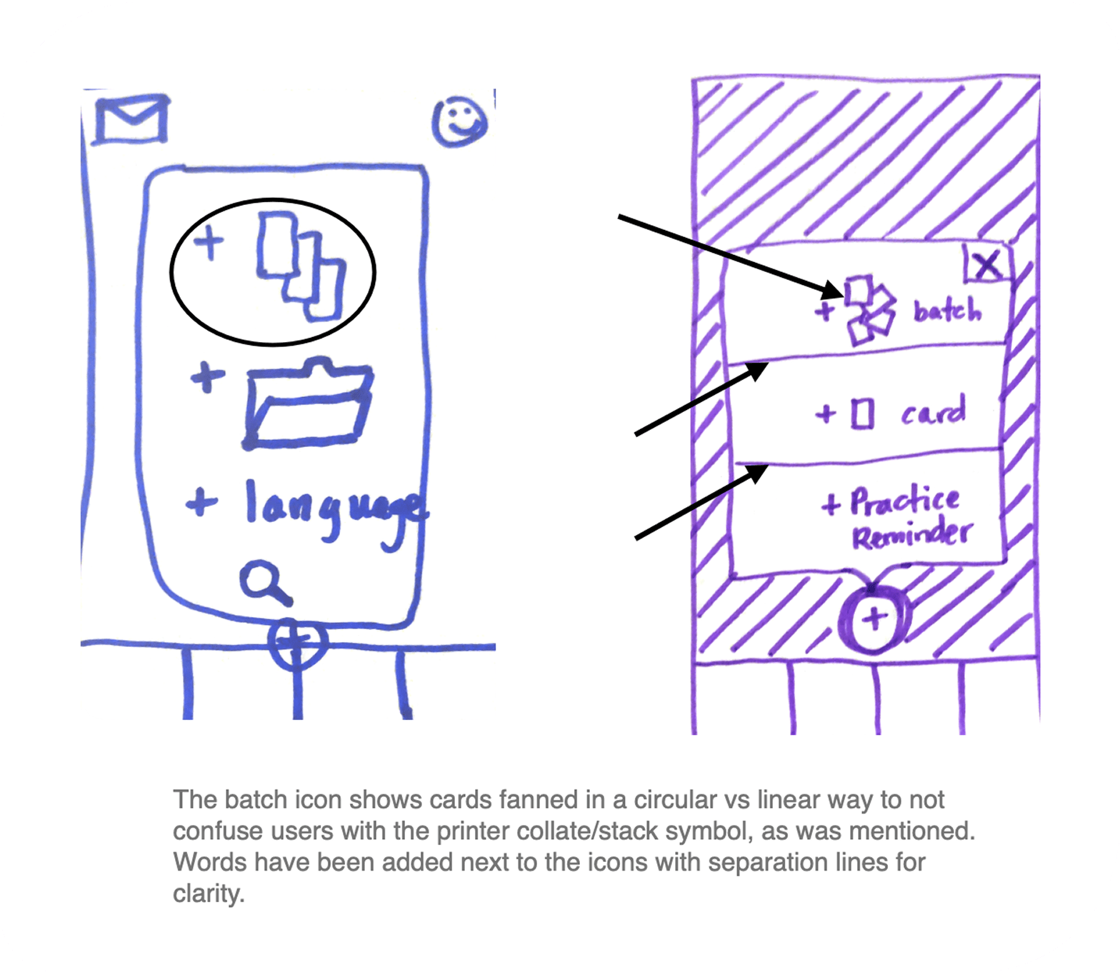
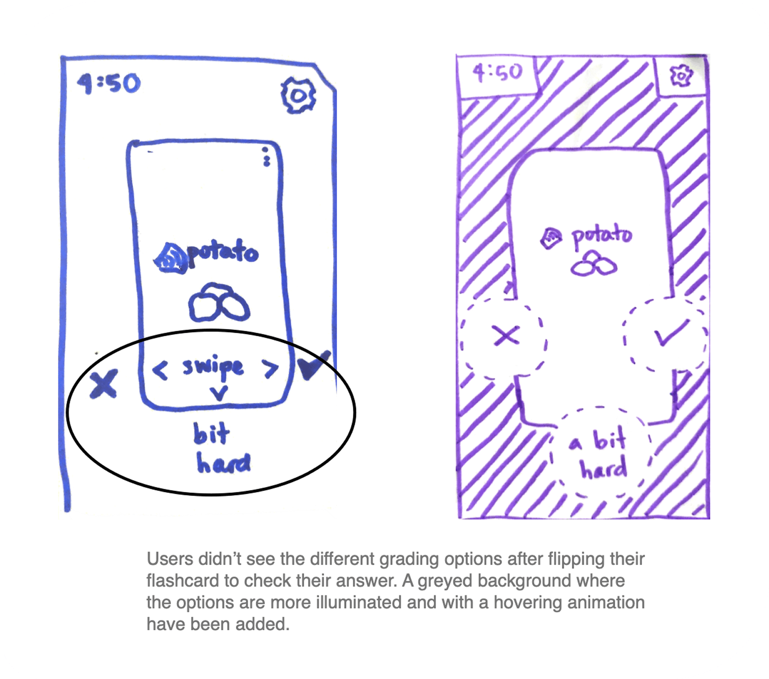
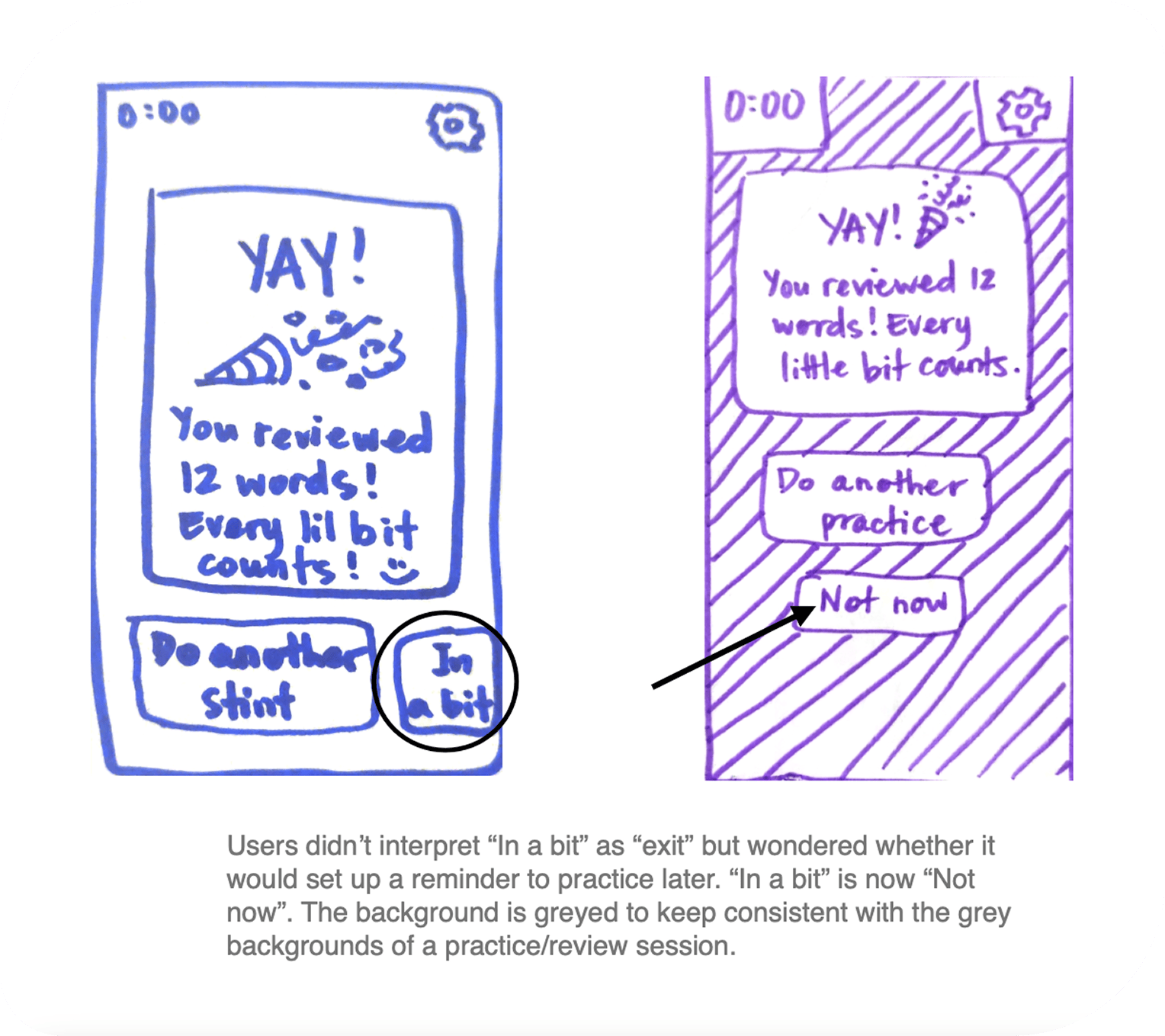
The Trouble With Nomenclature…
Processes: usability test report, iteration, UX writing
Tool: Jakob Nielsen’s error severity rating scale
…is that you need to find common ground. Otherwise, usability gets swapped with frustration.
For example, some learners considered “Vocab Map” as a way to add a new word or to do a review. Interestingly, some learners didn’t think “Review” was to review, since it sounded more passive next to “Chat Practice”, which was interpreted as review.
The bottomline was the diverse interpretations of “Vocab Map”, “Chat Practice”, and “Review” reduced task completion, namely: 1) adding a new word/flashcard; and 2) completing a review/practice.
After sorting and grouping the usability test data, I gave them error severity ratings to prioritize changes in the next iteration.
A recommendation was given for each error observation, and new low-fidelity wireframes were created, reflecting usability test results.
Find the one-page usability test report here.
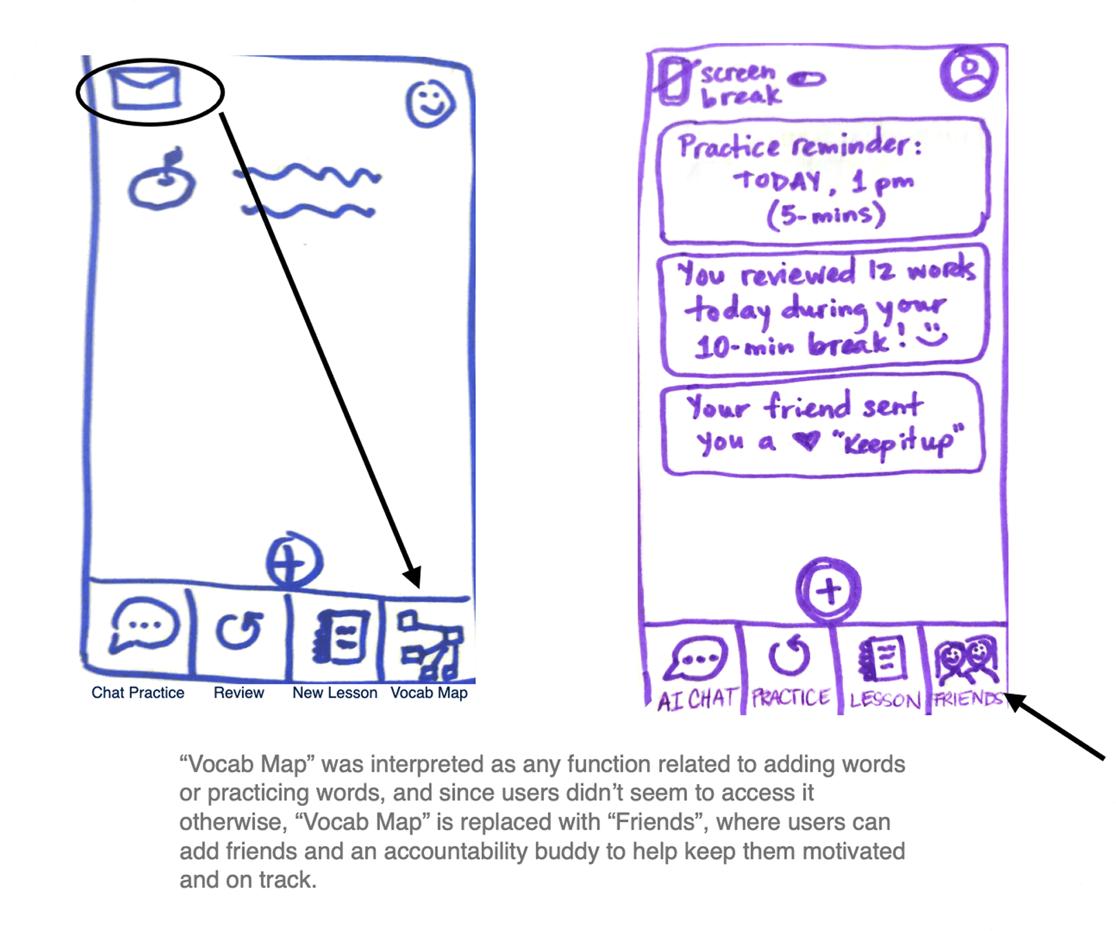
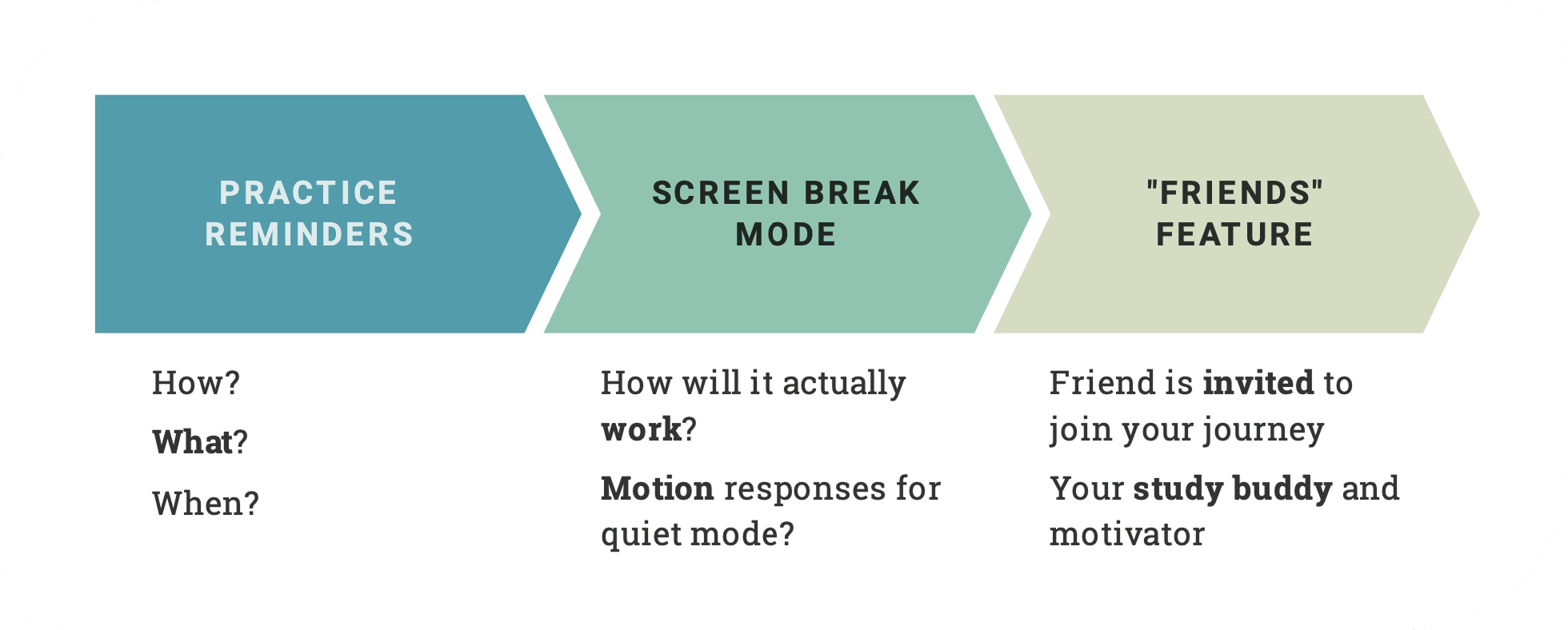
Friends Feature and Screen Fatigue
Processes: planning ahead, reflection
The unaddressed plot point in our learner’s story was the social element that was vital in sustaining motivation: How might the “Friends” feature invite a friend to be the learner’s study buddy and motivator?
Screen fatigue is a huge deterrent; once the learner turns on the screen break mode, what actually happens on and off screen? Could haptic/motion responses be effective here?
Practice reminders needed to take learners straight to the practice review—how might this look? User interviews showed us how reminders could otherwise be an annoyance with low practice effect.
I collected some learning gems from this project:
- continue getting better at sifting for insights
- focus on what is done over what is said in usability tests
- usability scripts can benefit from framing tasks as stories/scenarios
- exacting words and meaning is forever an art and a science
- if you think the wireframe is simple, make it simpler
Feel free to peruse the low-fidelity prototype demo here.
Or watch a video presentation of this case study here.
Thanks for visiting!
~ ViNa Nguyễn
ZOOP, personalizing exercise routines to your level, time, and motivation