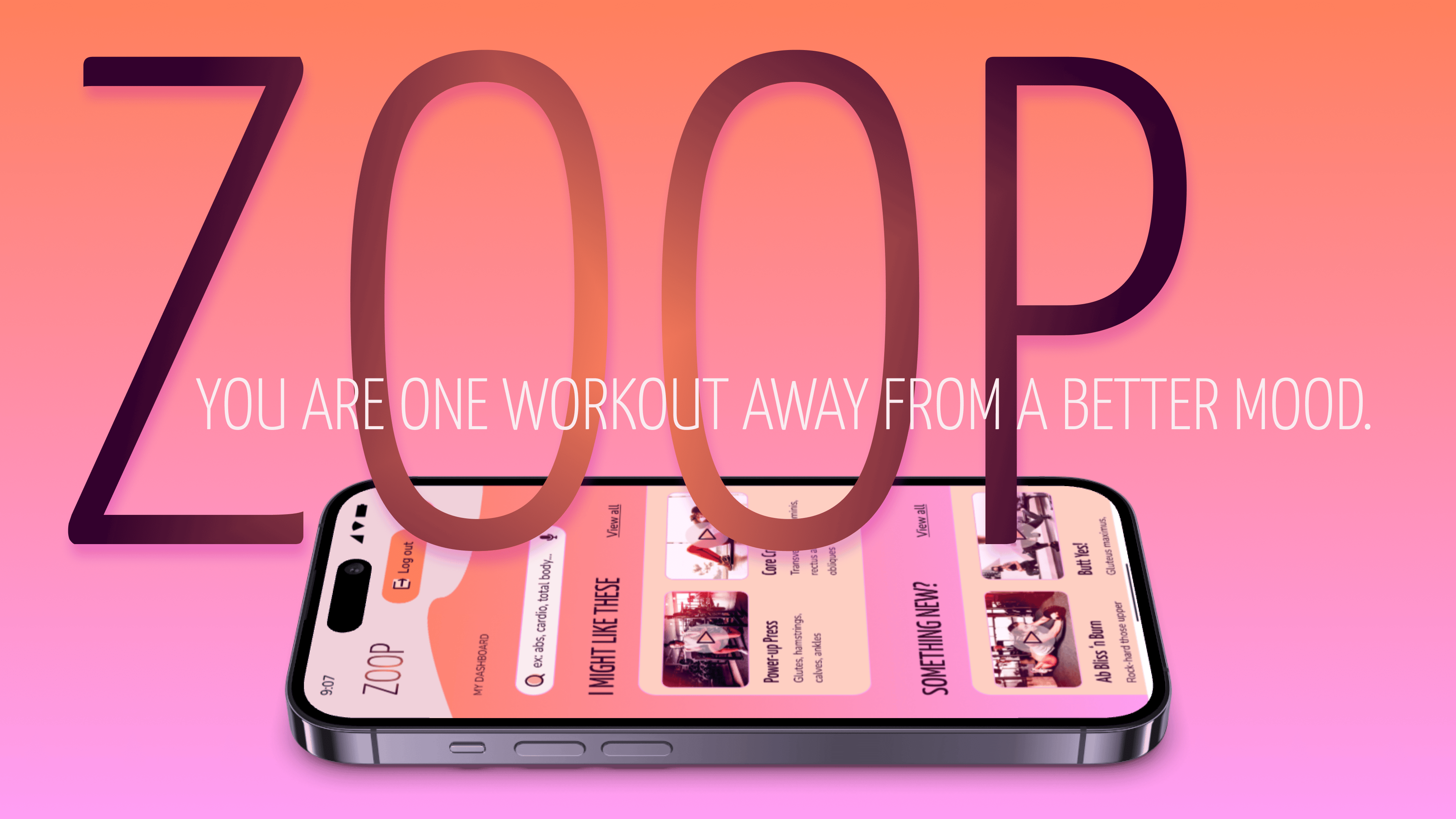
Overview
In 3 months, how might we design a web application that makes planning to exercise feel fun, motivating, and easy?
Context
Through CareerFoundry’s UI design program, I created moodboards that ultimately led me to the iconography, typography, UX writing, and colours in the style guide of the high-fidelity prototype ZOOP, in 2025.
My Role
UI Designer
Many Thanks to
CareerFoundry mentors: Hannah Loeffelholz and Deborah Howell
Contents
Dip in with a quiet video
Exercise Is Personal
Processes: user research, user stories, primary persona
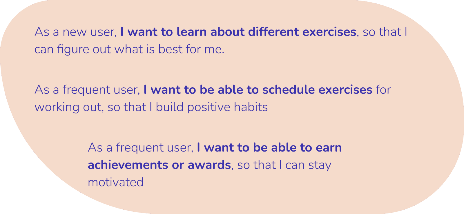
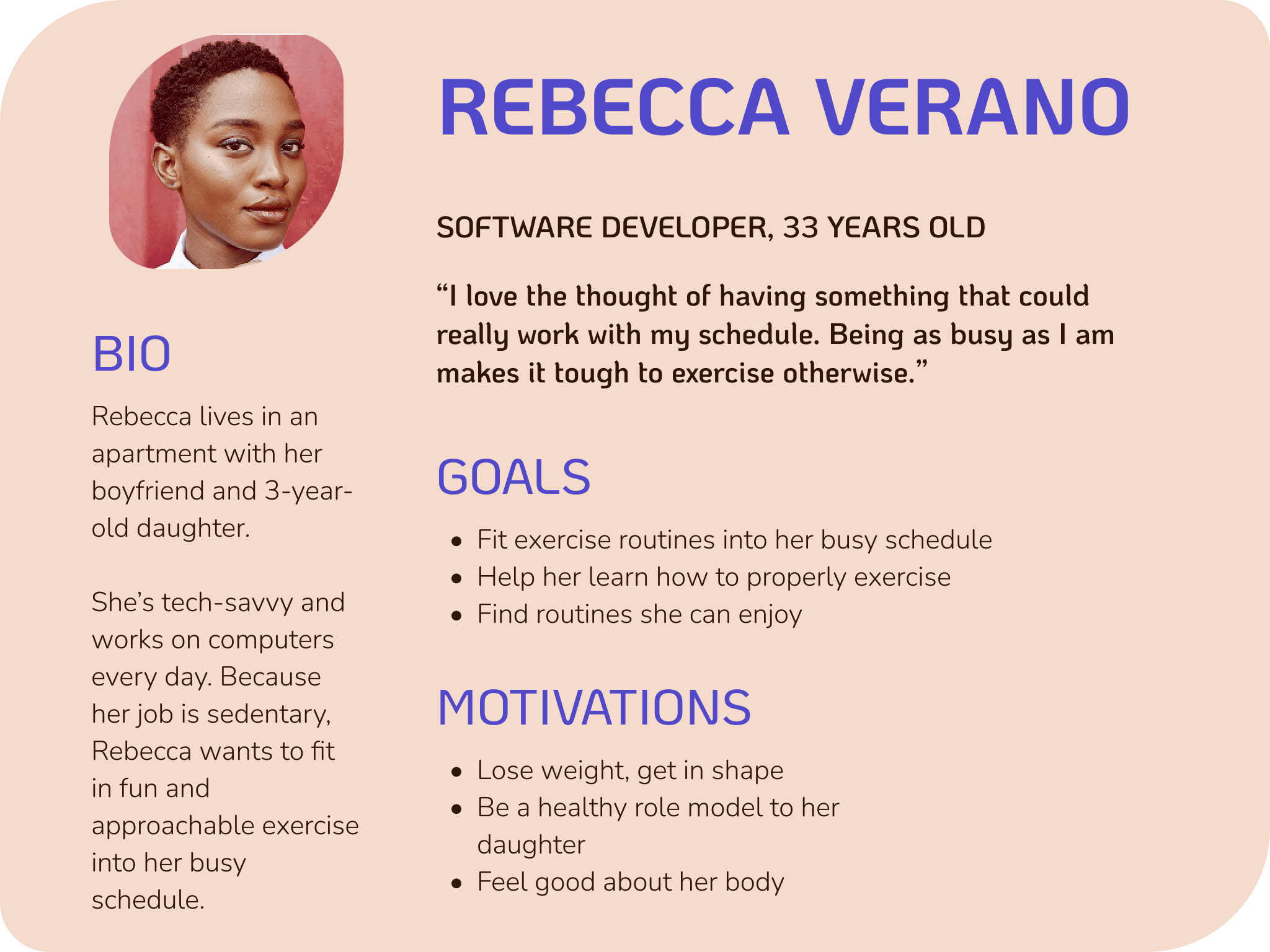
After reading through the project brief that provided the context, primary persona, user stories, feature requirements, and partial branding guidelines, I understood the problem as this: exercise needs to be absolutely personal—to the level, time, and motivation of the person.
Younger to middle-aged professionals want a sustainable and approachable way to exercise, but they find themselves falling short on these goals from low motivation, packed schedules, and using routines that are too easy or hard for them.
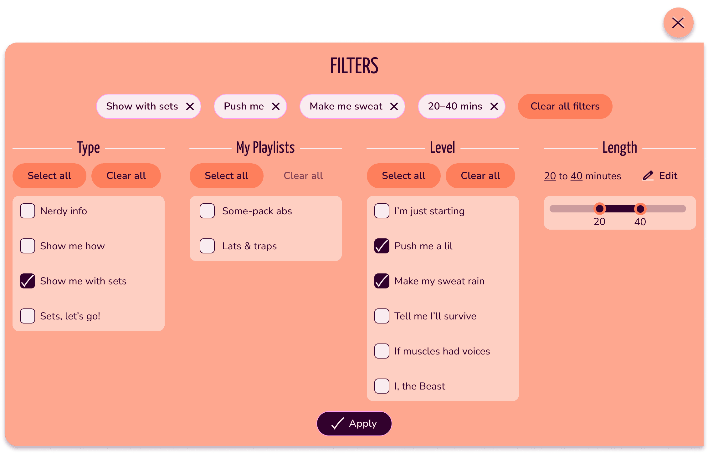
How might we make exercise truly personal? 1) Make it easy and accurate to search and filter for exercises by level of intensity and guidance and duration; 2) seamlessly schedule the exercises into the personal calendar; 3) motivate through gamification—streaks, badges, and points for specific workouts, body targets; and 4) make these exercises shareable so friends can also motivate and inspire friends.
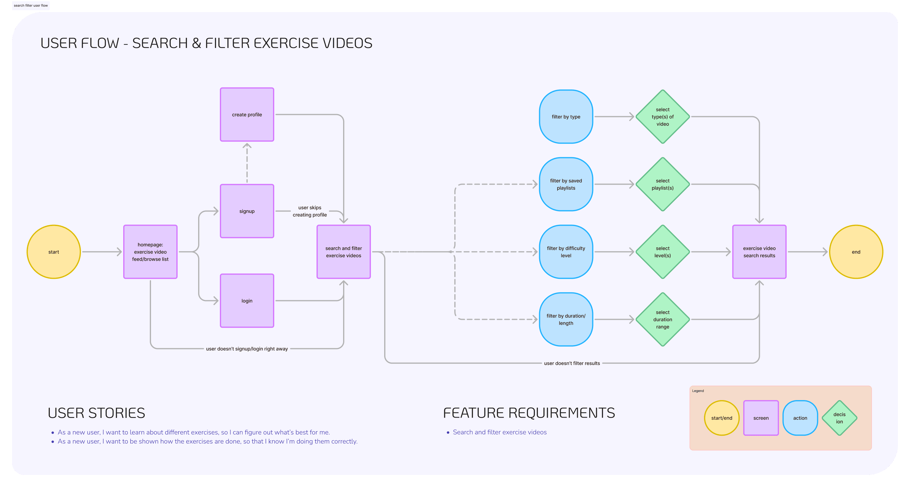
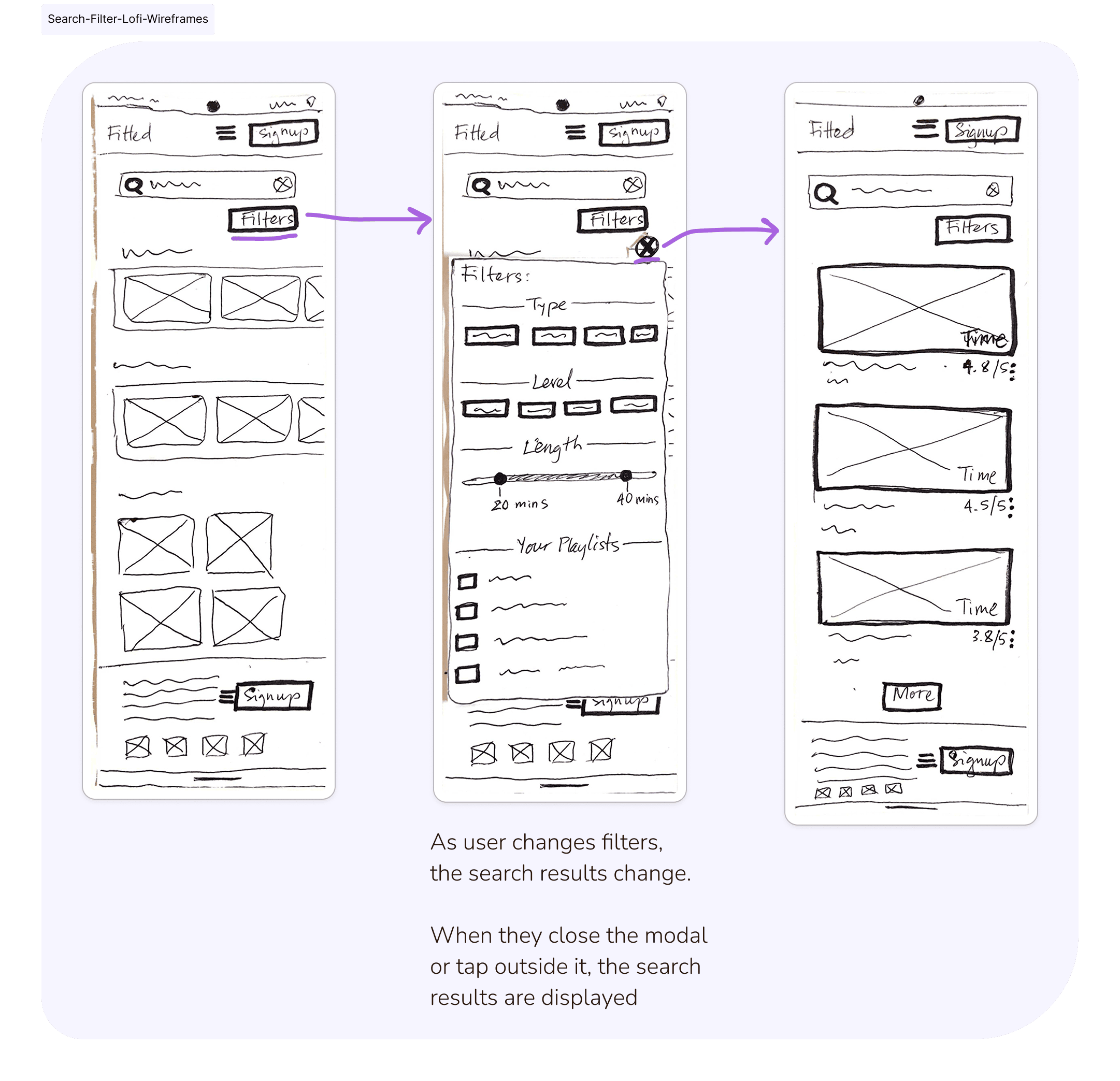
Brainstorm the Flow
Processes: user flows, low/mid-fidelity wireframes, rapid prototyping
Tool: Figma
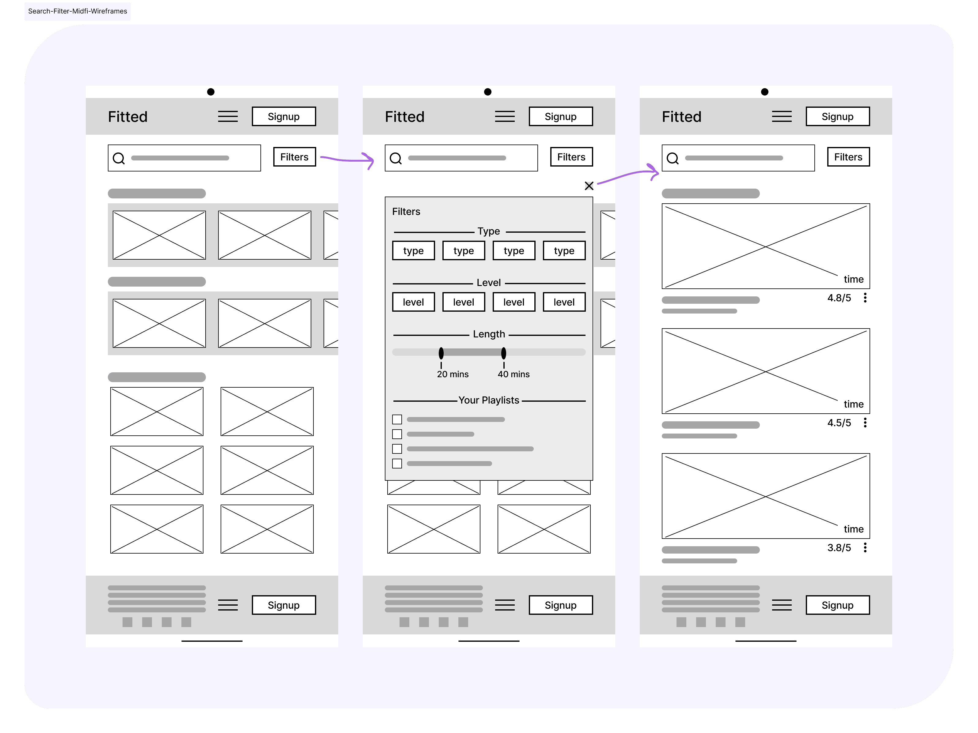
From the user stories, user flows were made, then rapid prototyping created quick low-fidelity and mid-fidelity wireframes.
You can view all my user flows and low-/mid-fidelity wireframes here.
How to Curate the Right Motivation?
Process: moodboard
Tools: Pinterest, Figma
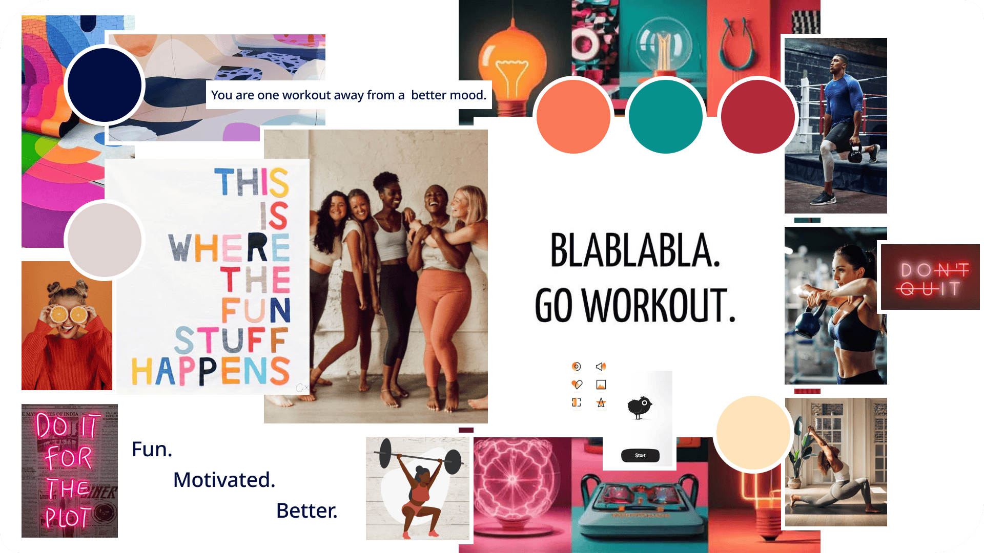
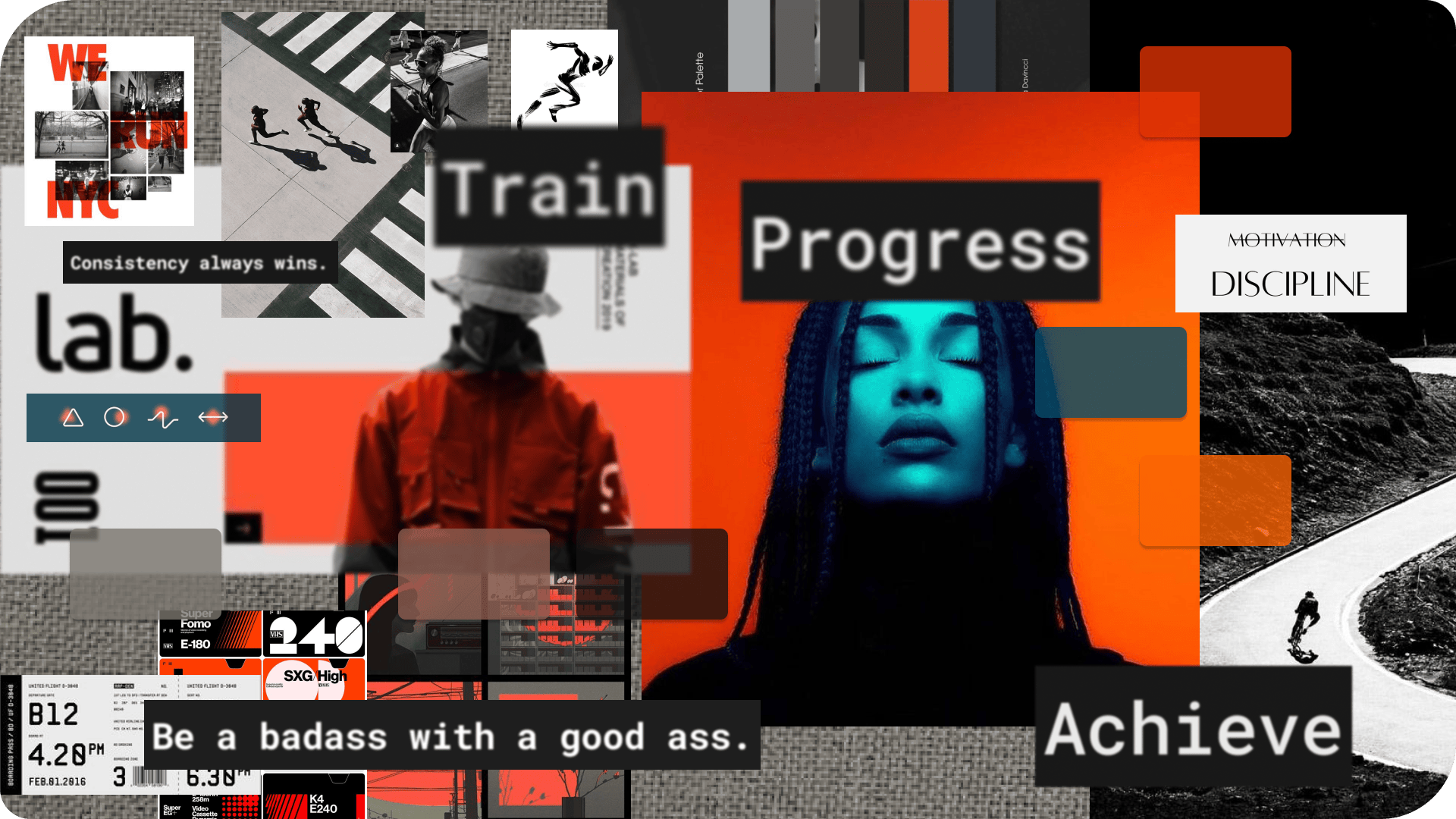
I zoomed in on the project brief to focus my moodboards. Variations of motivation, the desire to get fit, and committing to workouts, were starting points for my moodboards.
Moodboard A exudes a fun, lighthearted feel tied with a social side. It approaches motivation with a humorous, soft touch that feels caring and supportive.
Moodboard B portrays a disciplined, committed approach to motivation. It could feel more intense, as the idea is to push hard to get the results you want.
Moodboard A was chosen as the grounding theme, because it’s a closer fit to our primary persona, Rebecca, a more feminine person who wants to be motivated but to also have fun. There’s a more lively, social aspect to the moodboard, which ties well with Rebecca’s desire to share her routines with her friends to encourage them to take better care of their health. Given that Rebecca is also new or just returning to the workout scene, moodboard A could also feel more approachable and inviting than B.
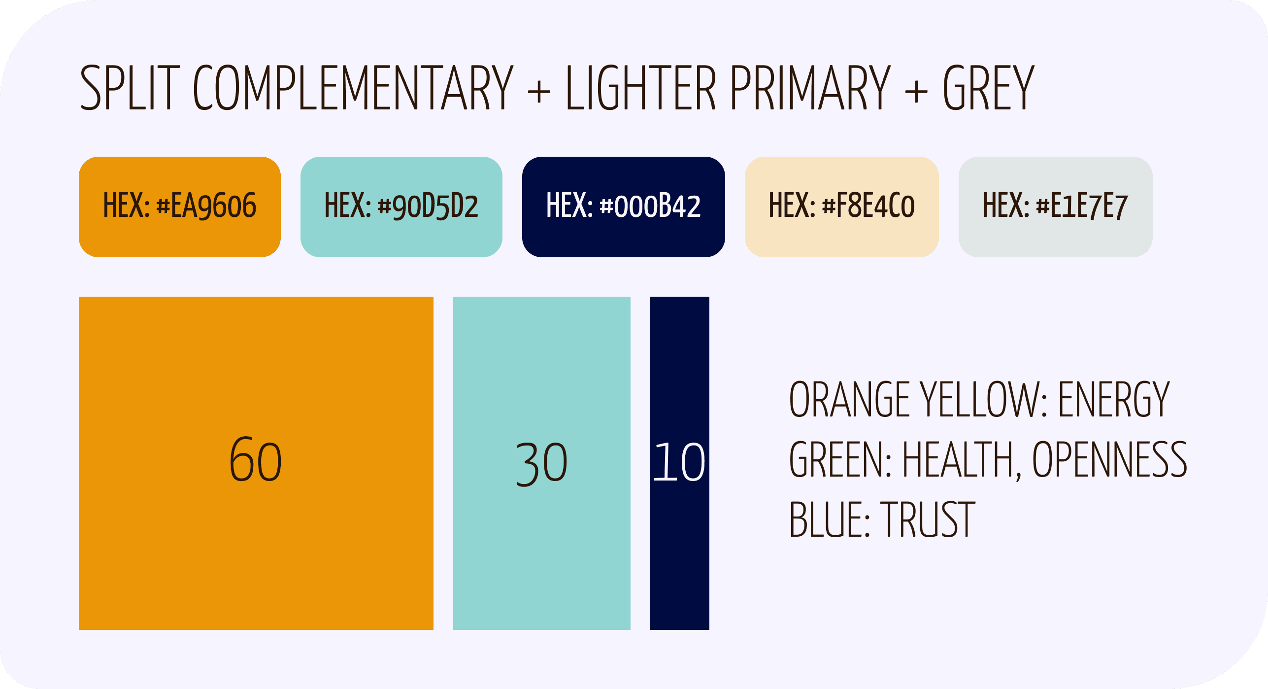
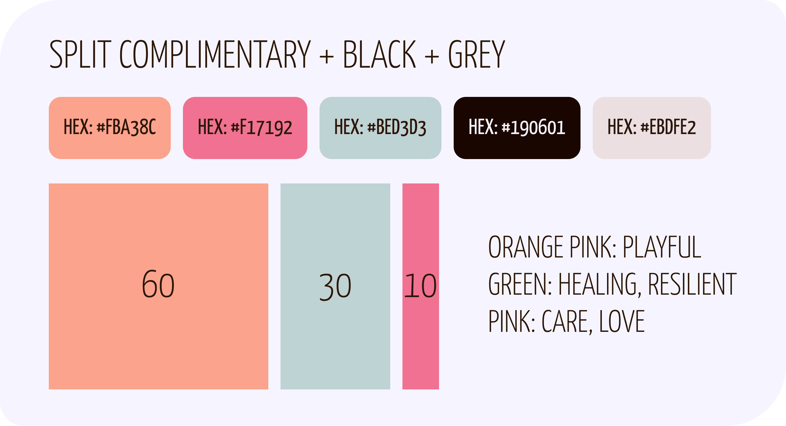
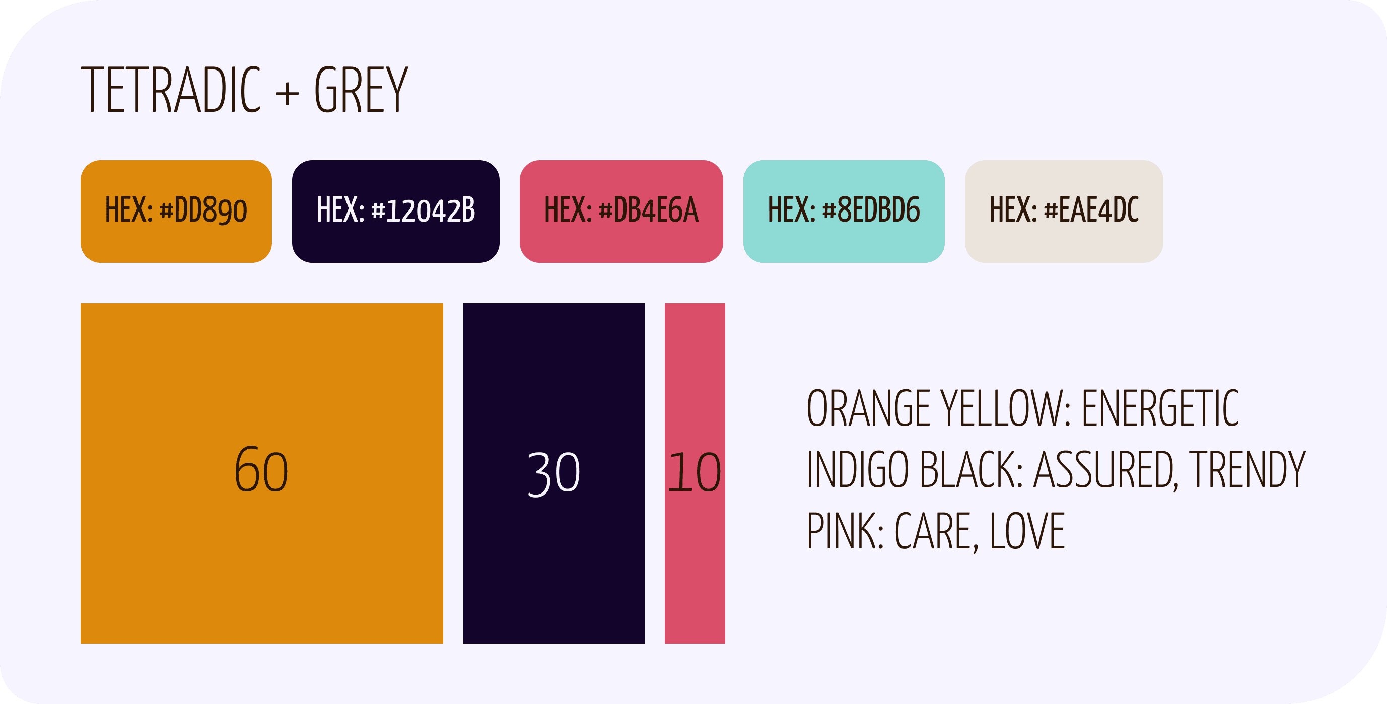
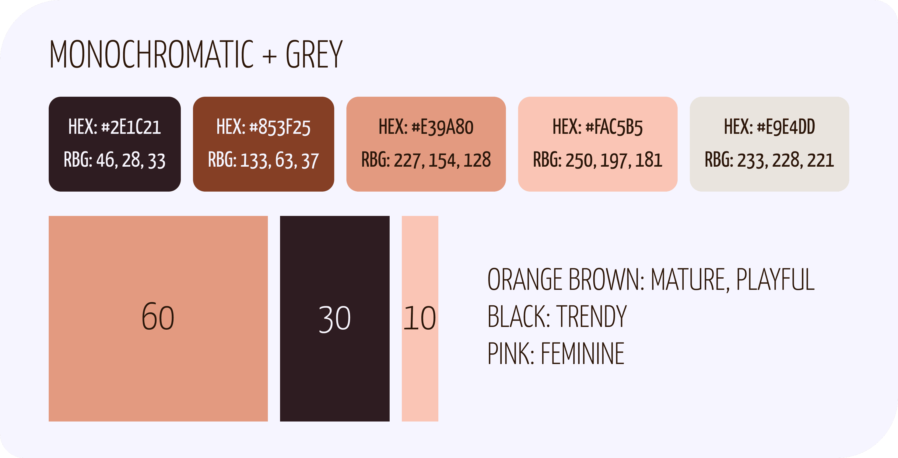
What Are the Best Colours for “Fun, Motivated, Better”?
Process: colour theory
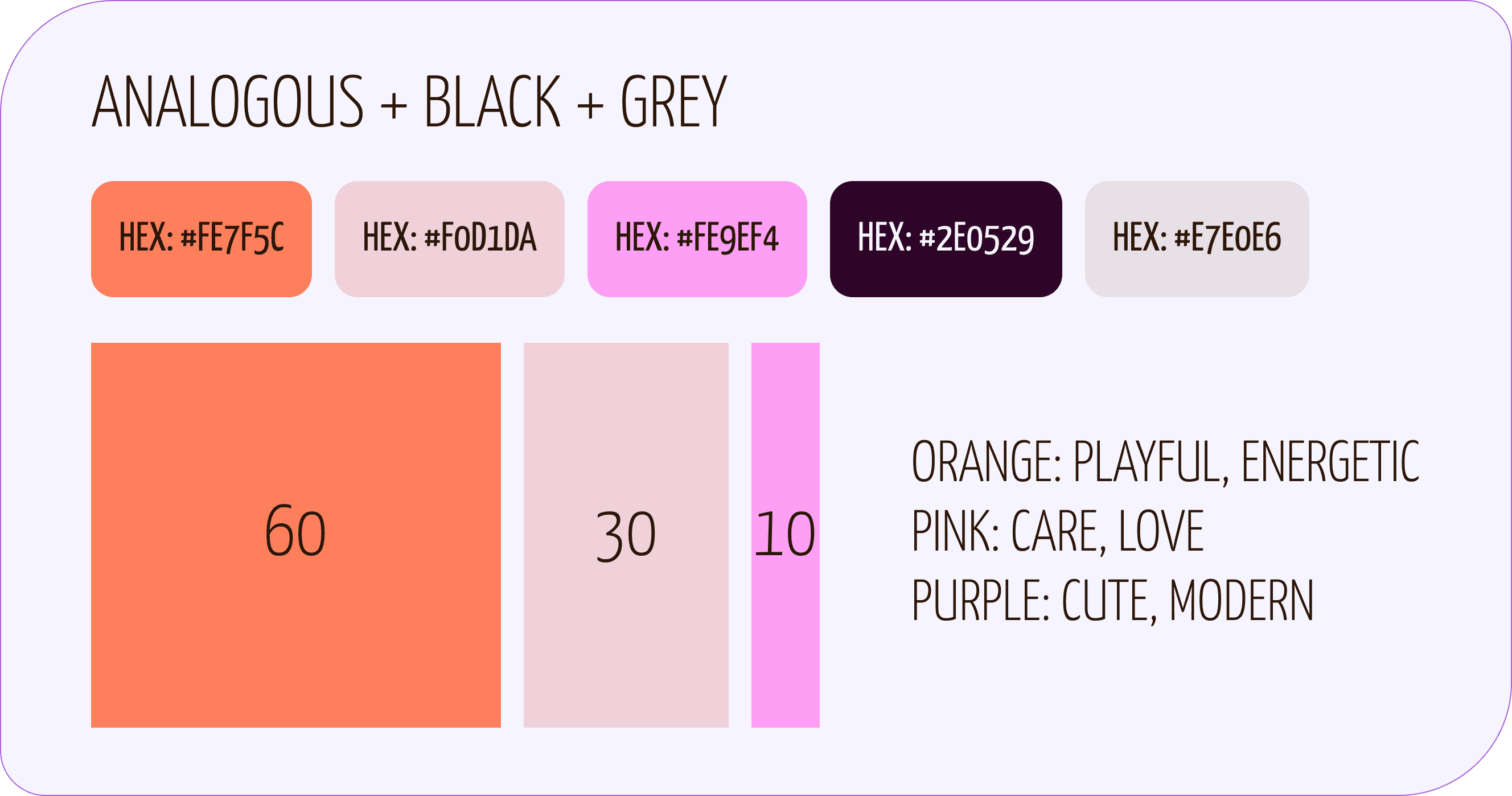
I referred to an emotion colour wheel as I distilled different colour palettes from my chosen moodboard. The colour harmony was also important in determining which colours were grouped together, to create a strong impression or a more nuanced one.
Five colour palettes were created, with each having an orange and black as primaries, as per the project brief. Colours were also modified to pass Web Content Accessibility Guidelines for text and background colours.
In the end, the last palette was chosen to emphasize a more feminine, social-focused tone.
Intense Contrast or Friendly Appeal?
Processes: peer feedback, preference testing
Tool: Lyssna
I received some peer feedback that expressed interest in a darker header/footer, as it could be more compelling to users. I wondered if it could feel unapproachable and intense for an exercise app.
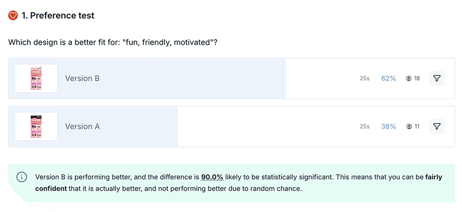
I decided to put the two versions up for preference testing. I recruited responses from participants who were within our primary persona’s age group (30–50 years old) and mostly women.
I asked participants which design is a better fit for: “fun, friendly, motivated”? Twenty-nine responses later on Lyssna, the lighter version received 62% of votes, and the vote difference was 90% likely to be statistically significant.
Writing to Motivate and Personify Energy and Fun
Processes: UX writing, iteration
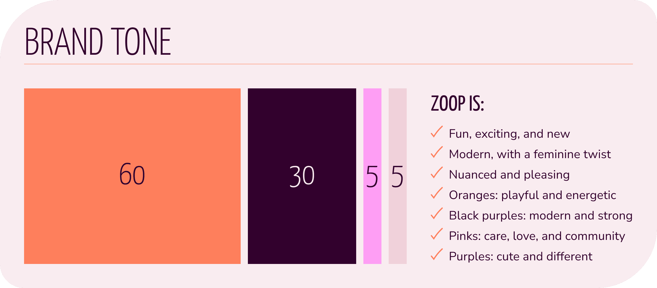
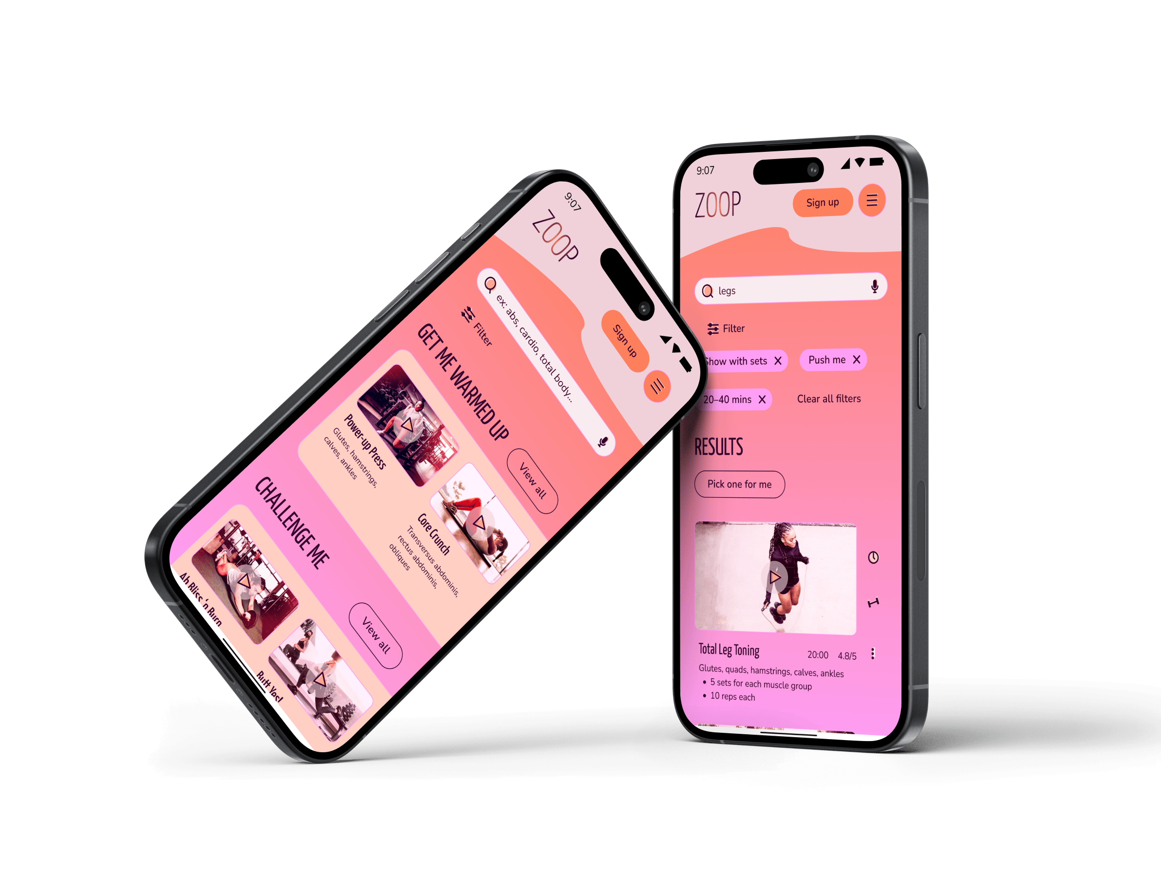
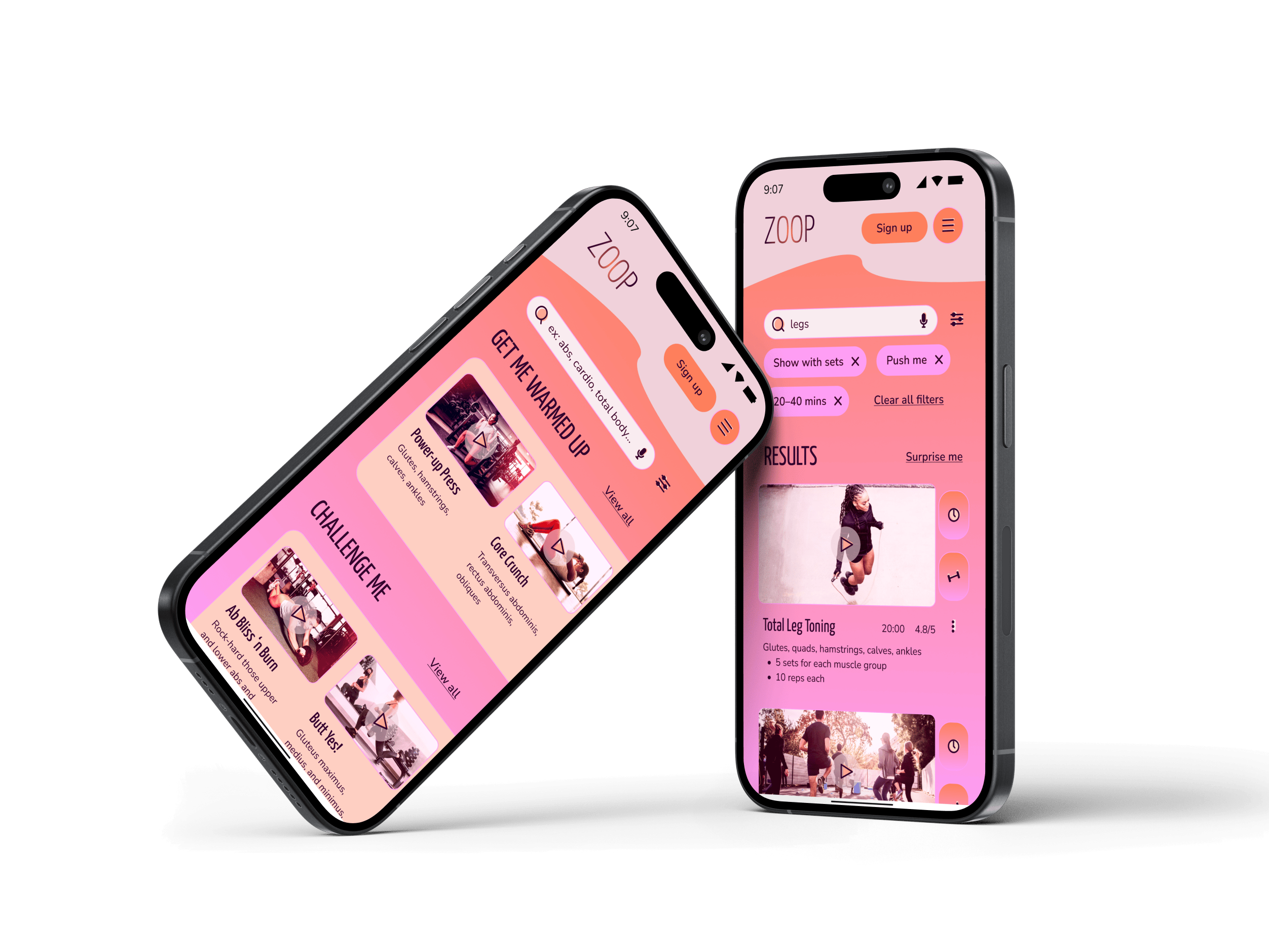
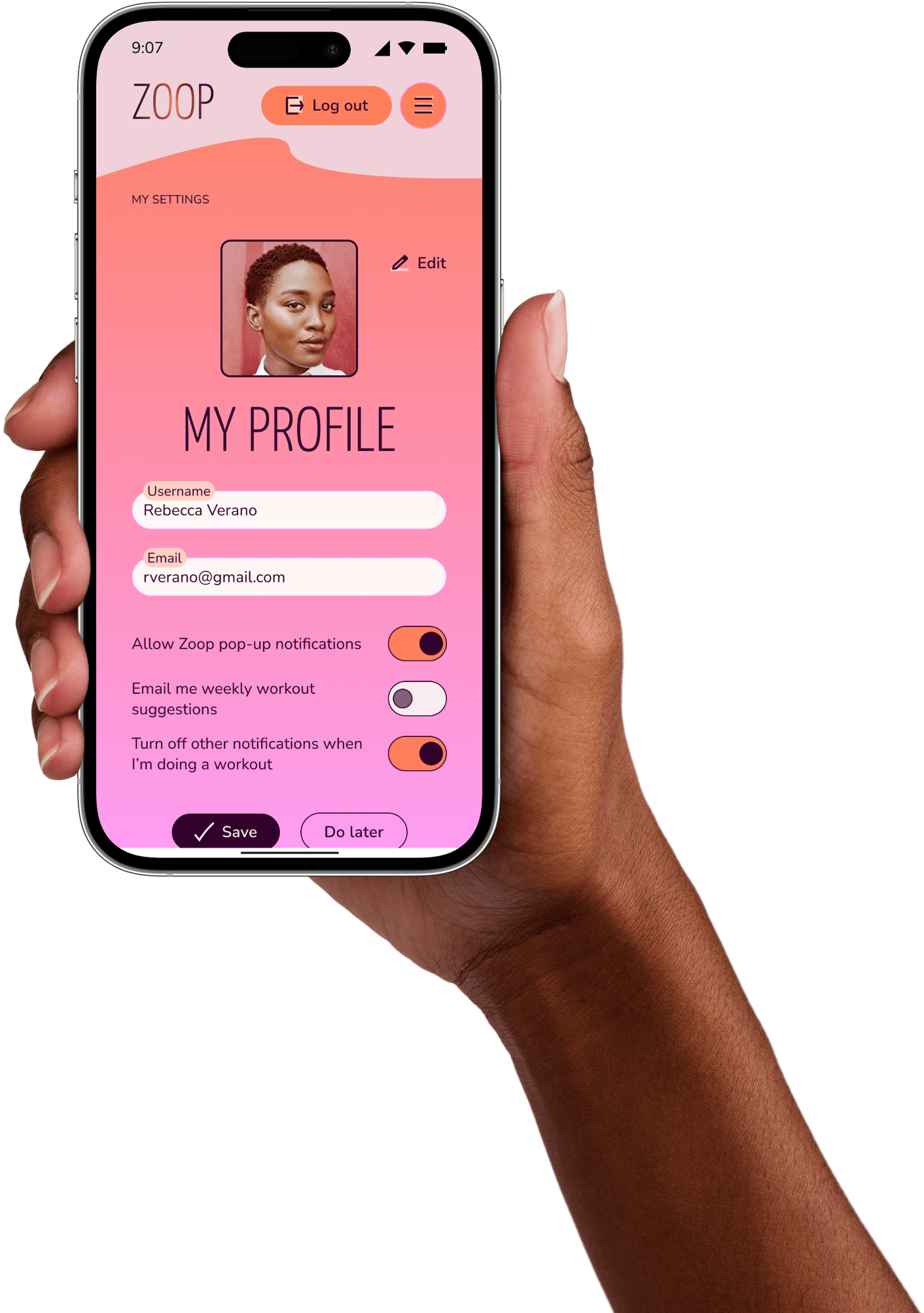
Throughout the wireframing/prototyping iterations, I kept in mind ZOOP’s brand tone: fun, motivated, better. It needed to maintain an upbeat energy while giving important information to support someone who’s just getting back into exercising.
I found this tone worked well with the gamification elements of badges, streaks, and XP’s—you’ll see this in the “FLEX” statements in the slideshow. Humour is also a psychology hack to switch someone’s mood, which is also a great way to boost motivation.
The copy could be humorous—ridiculous even—but it also needed to be clear. This was especially important when I created category labels for levels of exercise intensity, for example. I sought out feedback on my copy and paired it with visual design principles to support clarity. For example, labels were displayed vertically, to give the sense of moving up or down in level intensity.
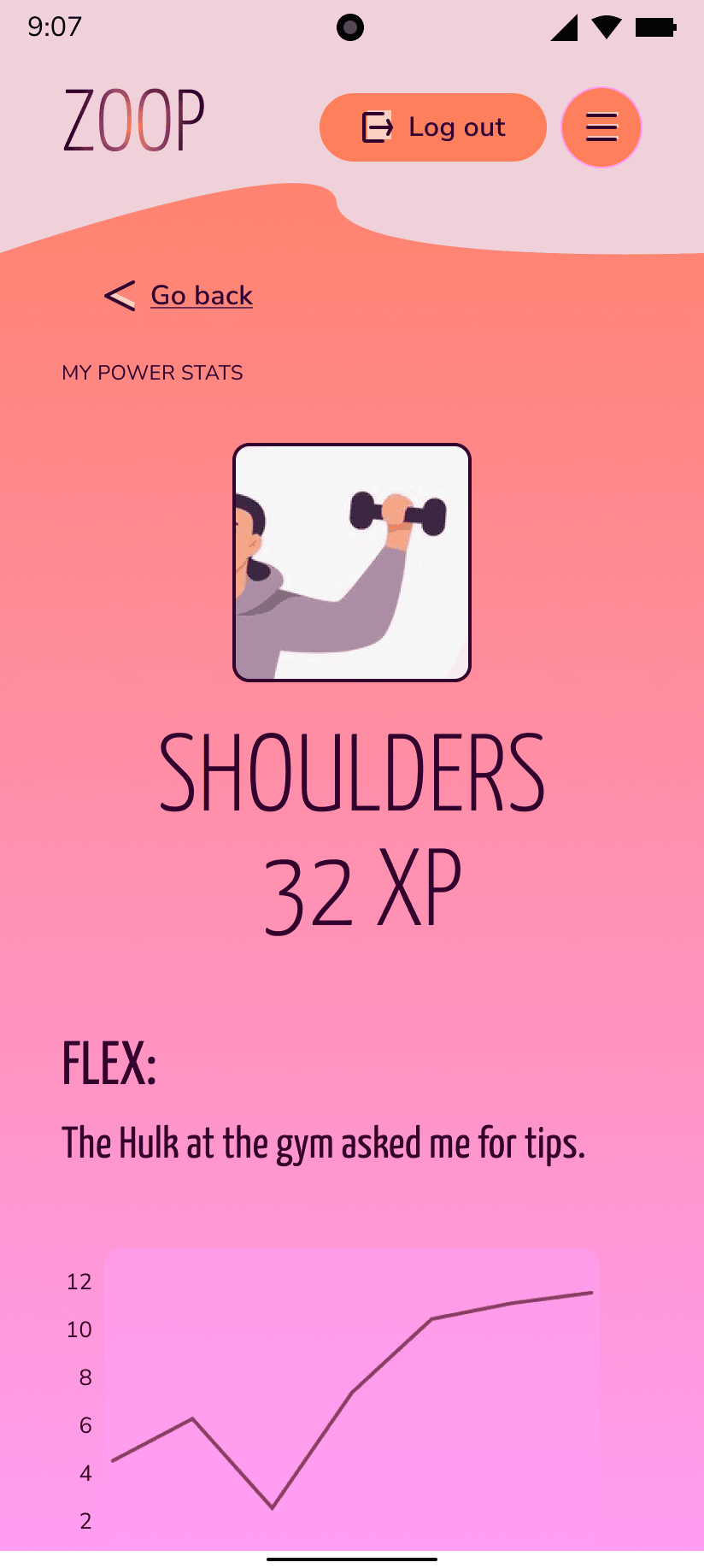
“FLEX” copy motivates by pairing humour with a pop culture reference. 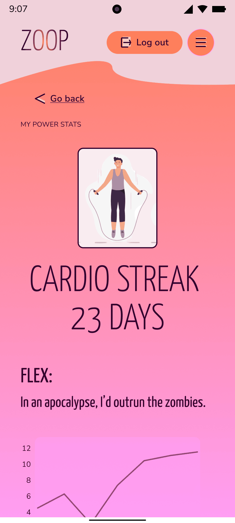
“FLEX” copy motivates by pairing dark humour with a pop culture reference. 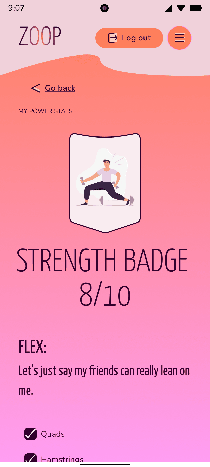
“FLEX” copy motivates by pairing a pop culture pun with a social benefit. 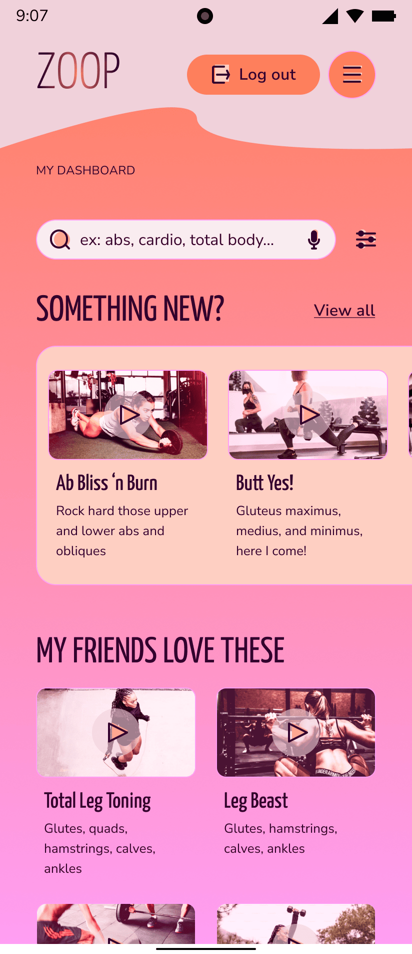
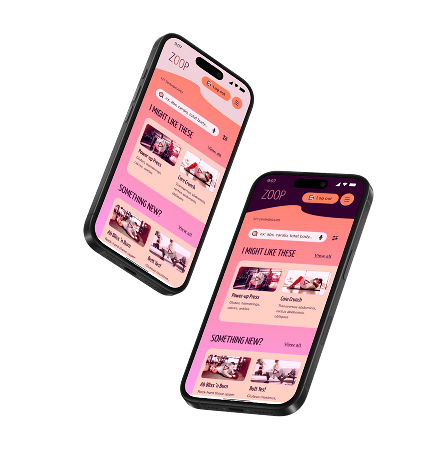
Video titles and body copy balance punny humour, information on targeted muscle groups, and personalized details to create an upbeat brand tone. 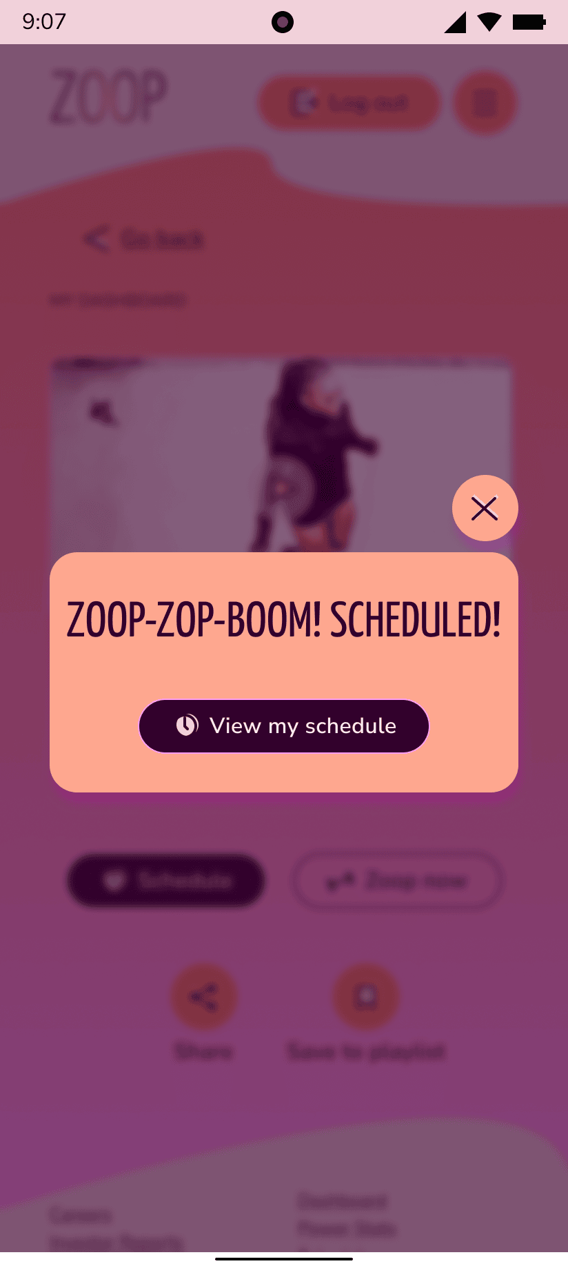
Notification modals associate the brand name with onomatopoeia to create an energetic, motivated tone. 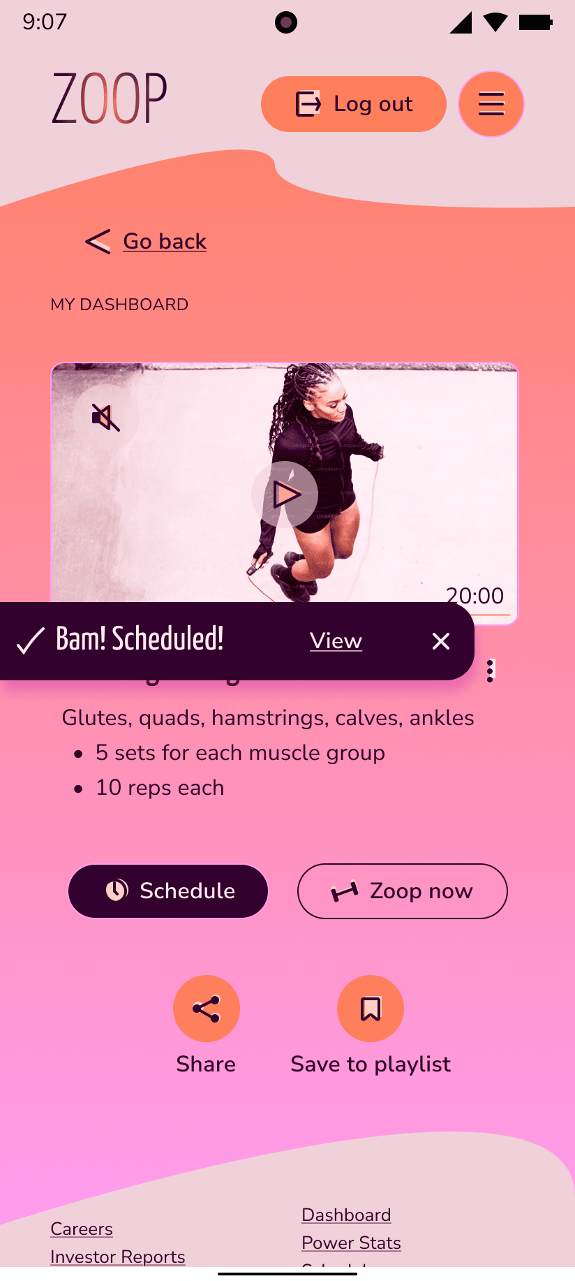
Success toasts also use onomatopoeia to consistently create an upbeat tone.
How to Be a Helpful Teammate
Process: style guide
Tools: Figma
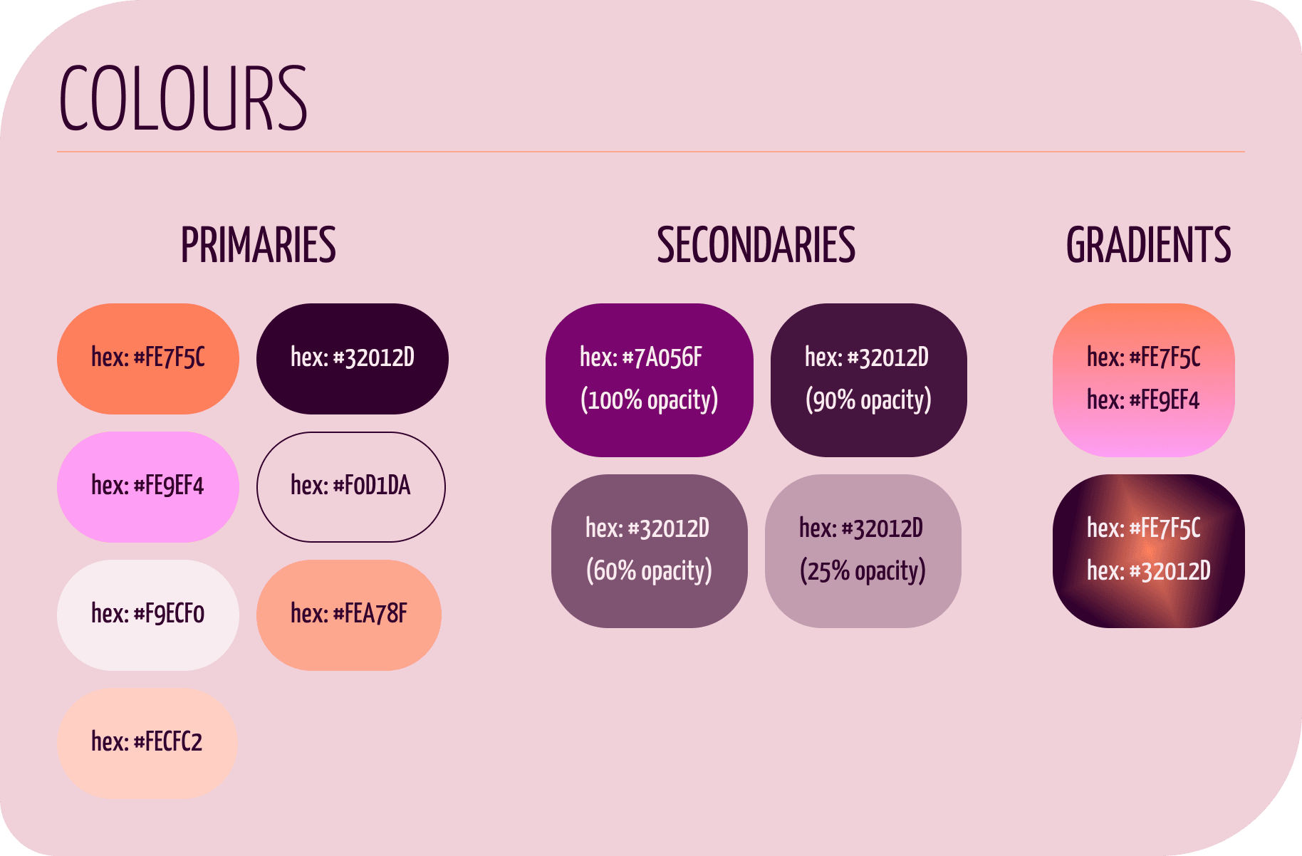
As my iterations began to gather consistencies, I documented them into a style guide (download here) as a reference for handover, a helpful communication tool, and for myself and other teammates to uphold our ZOOP brand consistently.
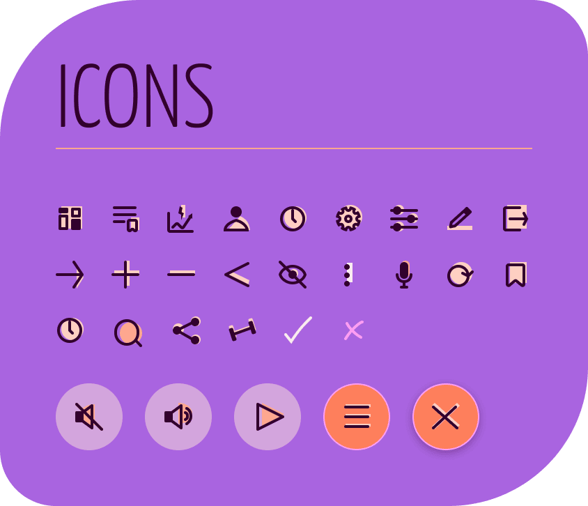
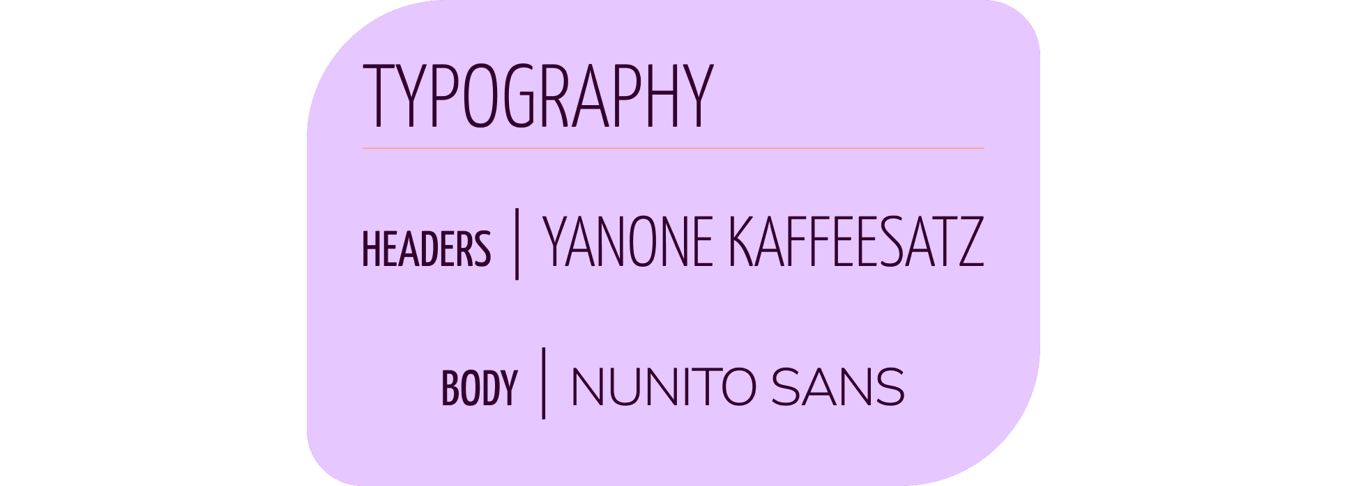
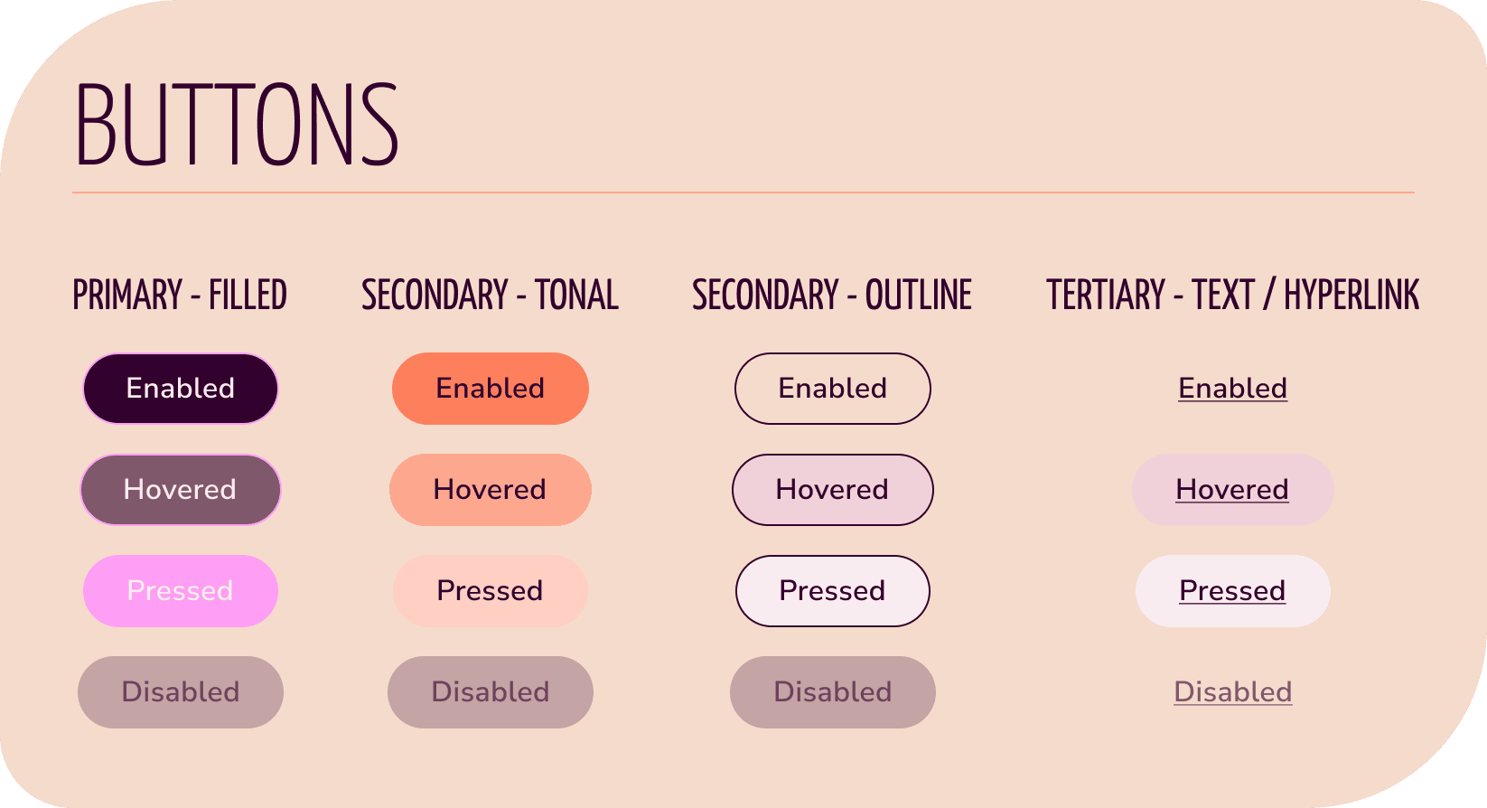
Some of the sections I created were guidelines for iconography, typography, colours, buttons, imagery, and grids.
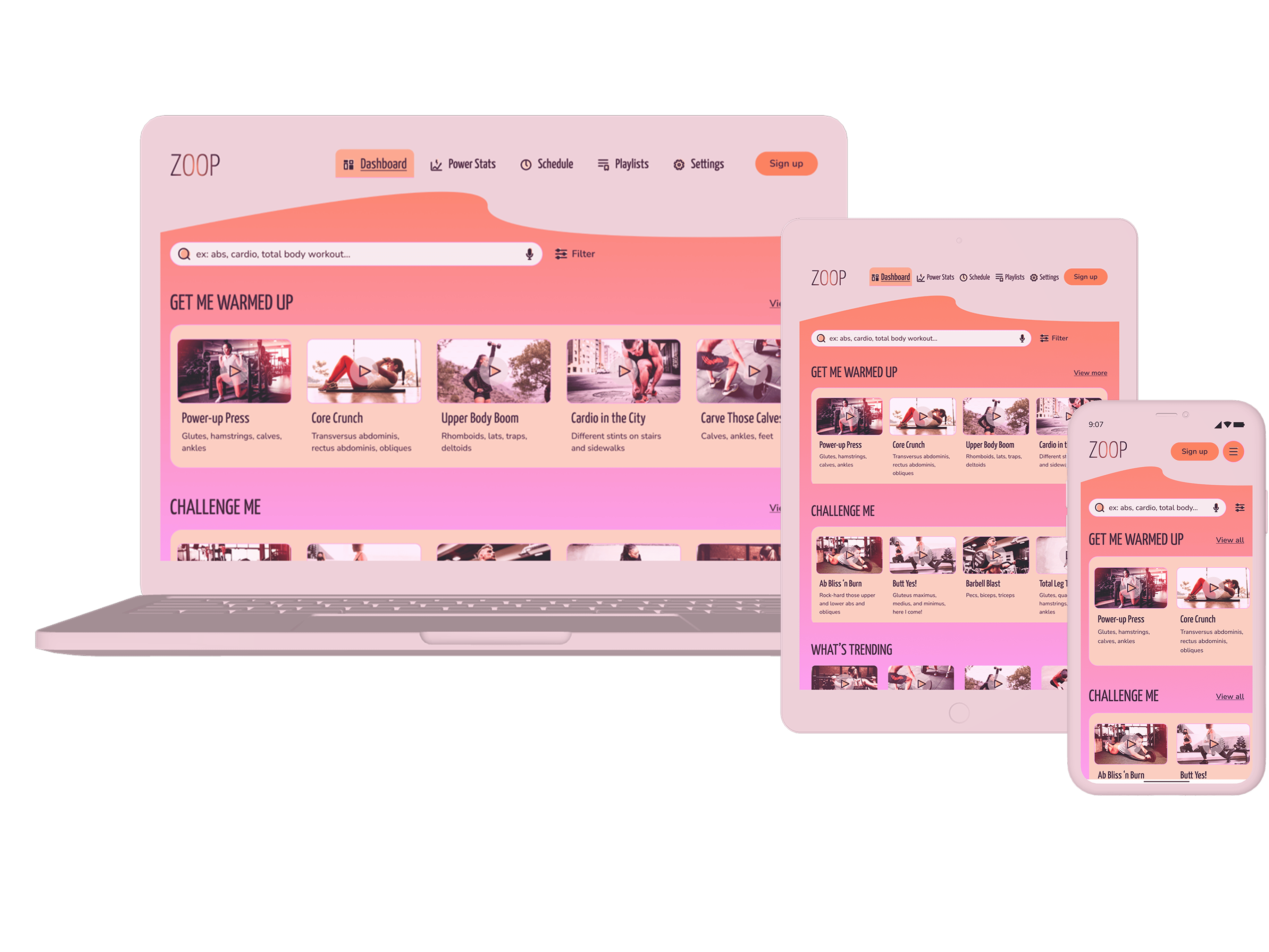
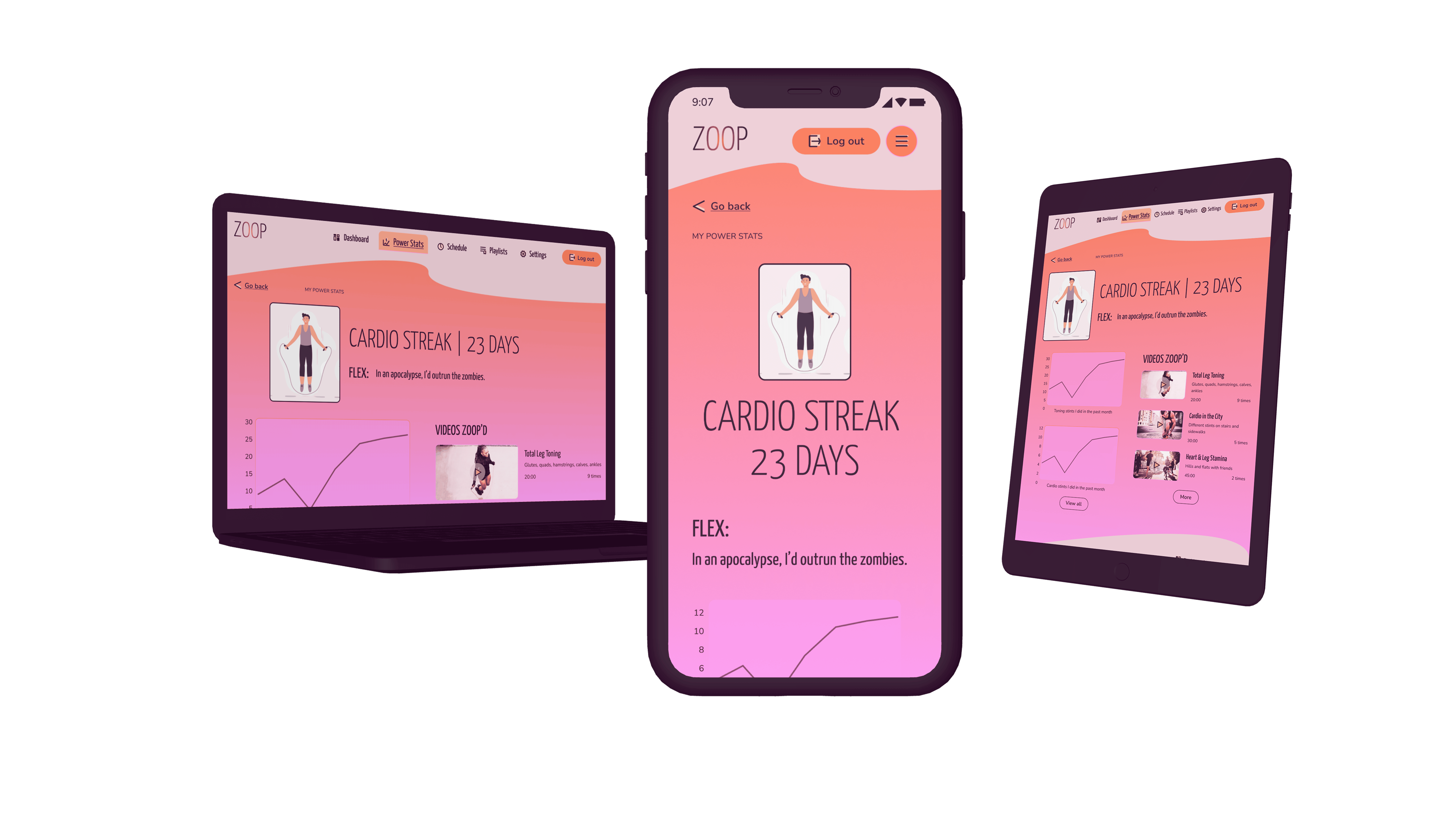
High-Fidelity Prototyping
Processes: prototyping, emotional design, mobile-first design, responsive design
Tool: Figma
As I connected my high-fidelity wireframes together into an interactive prototype, I sought out feedback from peers and my mentor and thought on emotional design as I created cheerful and energetic animations and micro-interactions.
My mentor, Deborah Howell, suggested some helpful UI patterns, like using a snackbar pattern instead of a simple text and button to clarify the signup flow and to put my quick action buttons on a card to help them stand out in their placement on the right side of videos.
I also designed the poignant wireframes for different breakpoints.
You can view a quiet walkthrough of my (mobile-first design) prototype below. You’ll find cheery animations like zippy checkmarks, poppy toggles and notifications, and bubbly success toasts, in addition to a full loading animation. Enjoy!
Beautiful UI Isn’t Necessarily Usable UI
Process: reflection
As I finished this round of high-fidelity wireframes for the prototype, I started rethinking some UI patterns I’d used and how they could be better. Are my scheduling fields easy to use? How are the filter sections making it quicker to find what Rebecca needs? Are the gamification elements motivating?
Being aware of and on the lookout for common UI patterns and emerging ones is an important part of creating freshness and usability in design. Also, usability testing would be an ideal next step.
Once again, feel free to peruse my quiet prototype walkthrough.
Thanks for reading!
~ ViNa Nguyễn
MedReady, optimizing multiple medications into a simpler, safer schedule
 ViNa Nguyễn